Thursday 27 November 2014

Where we are at...

Today we edited again on our short film and so far we have:
  • Put all the footage on to final cut pro
  • Added some music
  • Added video transition
  • Cropped and cut shots
  • Started to edit the colour in some shots
  • Added some of the sound from the microphones
However, we are continuing to edit the small details of our film. I we successfully pay close attention to detail I feel we will have a more successful final film as all the shots will fit together smoothly and will look very professional-like. To get this overall finish this means that we will have to continue to edit well and do this in and out of lessons. 

Tasks we need to do towards editing:
  • Finish colour alterations and make sure that they work together with the shots either side
  • Add foleys where necessary
  • Continue to add the sound from the microphones on to the footage
  • Adjust the sound levels throughout
  • Add a non-diegetic soundtrack in certain scenes *see note* (the restaurant and at the end)
  • Continue to edit in detail
After we have done this we will hopefully have a successful end product.

___________________________________________________________________

Non- Diegetic Soundtrack - NOTE

For a while we have been thinking about asking someone to create a soundtrack for our film: this is because the music on the royalty free websites do not suit our film. Therefore if we can find someone to help us with the music as it would fit more parallel with the film and I feel we would achieve better results with this method.

'DROP' Titling

Today as a group, we started to look into our titles. 

We previously filmed the pill dropping into a large container which we wanted to incorporate the text into. Originally we had the idea of having the 'O' as an image of the pill; however due to the position of the pill in the water, it didn't sit in the right place for the frame to allow the other letters to fit. 
 
Letters appear slightly slanted under the pill.

We then decided to have the letters appear as the pill has dropped and risen back to the surface (demonstrating that the 'drop' is associated with the pill in some form). 

Having it appear in a straight line beneath the pill was unrealistic as, when in water/liquid, things aren't in a uniform pattern. Because of this I suggested that we change the letters so that they were all slightly rotated and staggered. 

Wednesday 26 November 2014

Slumdog Millionaire - Poster Analysis

Media Language:
The 'Slumdog Millionaire' film poster.


Several aspects of the 'Slumdog Millionaire' poster help to suggest the theme and story of the film. 

Beginning with the characters:
  • The two characters, male and female, are standing close beside each other with the girls body turned inwards, implying a close bond between them.
  • Both of them have elated facial expressions and are smiling, demostrating their happiness.
  • The womens costume suggests her ethnicity and therefore perhaps the location of the film. 
The colours used throughout the poster further contribute to the feeling of 'happiness' - they are all very bright, which connotes a sense of excitemen. The colour orange is very prominent which is associated with traits such as success and energy. (click for colour associations/meanings).

Representation and Audience


Paint used at Diwali.
As mentioned before about the womens clothing, the colours surrounding her also help to represent her background. Mumbai (where the film is set) celebrates the occasion of Diwali, which involves a lot of colour and light, so the colours used are very representative of her background. 


'Slumdog Millionaire' is rated at a 15 because of its strong language and violence. 
The poster also shows a multiple choice question (as featured on the game show, 'Who wants to be a millionaire'. This context of gambling for money, may not be appropriate for certain religions i.e. some Christians disapprove of gambling. It also shows the characters to possess quite adventurous personas. 

'A film by Danny Boyle'; Boyle is a well know present film director so the film would perhaps be more appreciative by a modern day audience. 

Genre:
The multiple choice question asks: "what does it take to find a lost love?" 
This implies that the films theme is based on love and having to make choices; connoted by the several options listed i.e. money, luck, brain power, destiny. 

This also acts as a tagline which is in the typograohical style of the tv show: 'Who Wants to be a Millionaire' which allows the audience to associate the film with money and the idea of a gameshow being a major part of the plot.


Typical Conventions 

The layout and composition of this poster is very simple but makes it clear. The main text of the title is placed slightly off centre to allow room for the image. The title is justified and cleverly incorporates the directors name as to create a clean look.  

The type is all in upper case to really put emphasis on the contrast between 'slum' and 'millionaire'.

The quote by 'News of the World' is also show in capitals, with some of the type in a larger font. This is to draw attention to the importance of the key words and promote the film.

The billing block is placed at the bottom of the poster and compliments the design as it takes the same layout. 


Poster Analysis - 'The Imitation Game'

Click to enlarge

Mise en Scene/ Media Language:
Firstly, the costume that the character in the poster wears seems dated therefore suggesting that the film is set in the past. After looking at the IMBD website my initial thoughts about a film set in the past were true, as this film is set around the 2nd world war. This context therefore explains the slogan: "Behind every code is an enigma" where enigma is a sophisticated term to explain mystery and questioning. In the world war, messages would be written in codes by each side to stop the other side from finding out their secrets. However there were some events where the British tried to 'crack' these codes; this is what I think the slogan is trying to hint at.

The code cracking motif is also demoted in the textual graphology in the poster: the image is layered with lined up circles and in some of these circles appear letter. I feel that this design looks code-like and therefore further hints at the code breaking theme.

The title of the film does not follow conventions that I have seen in the other film posters that I have followed. In this poster the title is one of the smallest elements, contrasting with the others which have bold and large titles. Therefore it can be hard for the viewer to notice the film title. However this would have been a conscious decision and not by accident where the creators could have thought that the other aspects of the poster were more important and that the reader would be able to find the title easily once reading the slogan (as the eye is drawn down to where the title is). Nevertheless, the title is still a contrasting colour which makes it still somewhat significant.

Representation:
Other version of the poster
Benedict Cumberbatch is the actor featured in the poster. I feel that the creators would have chosen to place him in the poster as he well known to the public. This means that fans of Cumberbatch will be more likely to watch the film, along with others who know of this actors success, therefore making the character a representation of the success of the film. This is also why a close up shot is placed of him so the audience can identify the actor easily, plus he is making eye contact with the camera which looks as if the poster is looking straight at its audience (a persuasive technique called Synthetic Personalisation - Norman Fairclough). I also found an alternative poster with Keira Knightley as the character in the poster for the same effects. This is an example of Dyers 'Star Theory' where famous people are placed in the media to persuade audiences.

Cumberbatch's facial expressions make him seem worried which could translate to a meaning of him being nervous about the code breaking. However as he is on the main poster this could suggest he is a protagonist rather than an antagonist. Also as the actor usually plays protagonists in films the audience know him as a good character and would be pleased to see him do the same in this film.

Audience:
From looking at the BBFC website it is evident that the rating of this film is a 12A for the following reasons:
  • Reference to sexual activities
  • Includes mild language e.g. "bloody"
  • Scenes of mild violence - A man being punched
  • Characters seen to be smoking
However, like 'Before you know it' I feel that the actual audience who will watch the film would be older than 12. This is because I think the characters are mostly adults and it is based in the world war where only older people would have a good knowledge about the event. Therefore I feel the film will attract people aged 16-40 as these people will know more about the world war, but will also be interested in watching a film with characters in their 20/30's. 

I feel the social class of the audience will be B-C2 as these people have a disposable income to go watch a film and will be able to relate more to actors who are represented as middle classed.

Genre: 
The IMBD website states that the genre of this film a Thriller-Drama which is a sub-genre. I feel that this is connoted in the poster as the slogan hints that the characters will be searching for the code answer, making it a drama. But also as the film is set in the world war some negative and disturbing scenes may be present (for example death) which makes the film more like a thriller

The lighting on the actors face suggests a serious tone as its is realistic and looks natural, therefore mirroring the genres denoted. On the other hand the characters facial expressions are also serious which helps to further denote the genre.

These semantic codes (Rick Altman's theory) also support Steve Neales theory of Repetition and Variation as they link to the genres denoted, but the variation is the two genres put together in the film.

Tuesday 25 November 2014

Four Weddings and A Funeral - Poster Analysis

Media Language
Unlike the majority of film posters, Four Weddings And A Funeral doesn't comply with all conventions i.e. the title isn't shown in capital font but more of a handwritten style. 
The text is also shown in Pink, connoting love, perhaps more of a 'crush' or something that he can't have - red would be a more suitable colour to suggest passionate love. 

The props shown in the image also help to portray the genre:

  • The sheep is very abstract, creating enigma and comedy (why is there a sheep at a wedding?) 
  • The amount of people gathered around the piano demonstrate chaos 
  • The vicar/priest pushed to the end shows a chaotic environment, he doesn't appear to be very involved. 
The poster is made up of a white background with the other features layed on top. The colour of white and the amount of blank space suggests that it is a lighthearted film, as white is a very neutral colour. It can also be associated with innocence and weddings so fits well with the theme and content of the film. 

The camera shot used for the image is very level and all the characters are shown at the equal distances from the camera, suggesting that it is a 'cheery' feel good film, a neutral shot. 

Genre:
The style of writing (a semantic code - Rick Altman's Theory of Genre) also conveys the humour and comedic genre, as it is accompanied by a heart with an arrow; the titling is somewhat more 'fun' than typical titles to enable the viewer to have an understanding about the film. 
The colours used in Romantic films is typically reds and pinks as they connote love, therefore supports Steve Neales Theory of Repetition  and people can associate the feature with the genre.  
The image together with the title immediately suggest that this is a Rom-Com film as it tells you there will be a wedding, and the props such as confetti being thrown reinforce that.

Audience:
This film is rated at a 15 certificate due to strong language and moderate sex references.
The name of the film tells you exactly what the film is going to include and for people under the age of 15, they may not fully understand some of the concepts. This is why i feel the target audience could be genralised to 15 years upwards. 

Some of the Actors such as Rowan Atkinson and Hugh Grant, would be more relatable to a slightly older audience such as 35-50 and as would the concepts of weddings and funerals. 

I think the social/class band of B-C2 would be appropriate but could also include people within A or even D. This is because despite it being an independent film, it became very popular meaning that the film would appeal to a variety and would be shown in cinemas too, unlike many small budget independent films. 

Representation:
The imagery used in the 'Four Weddings and A Funeral' poster easily shows the characters as they are all showed lined up. 

The character on the far right is presented as somebody who is ecstatic, shown by his body language; the jump itself implies that he is celebrating something, and the way his limbs are reaching out shows he is supportive and happy - and so is represented to be an excitable man.  

The Women to the left wears a yellow dress, demonstrating perhaps an extravagance to her persona. Her facial expression i.e. a pout, implies she is a women with a strong personality and very feminine, a bit 'sassy'. 

Poster Analysis - 'Before You Know It'

Mise En Scene/ Media Language:

The main colour denoted in this poster is orange: according to colour-wheel-pro the meanings of orange are
  • Energy
  • Happiness
  • Creativity
However, further down the website says that the gold-orange colour connotes wisdom and wealth. I think this is appropriate as gold-orange tones are present in this poster.

The colour also matches the character in the poster. He looks elderly and therefore could have a breath of knowledge (wisdom), but his wealthiness is not evident yet to the audience. This is because he is not facing the camera and therefore creating restricted narration. However, 'your golden years' relates to the elderly meaning this further links the golden colour to the character.

Representation:
The character in the poster seems as if he is a protagonist as there is high key lighting and his posture is neutral. But when looking at the IMBD website for this film I discovered that this film is about 3 homosexual males. The way that the man is represented in this film does not fit the stereotype of homosexuals, meaning that this film could be trying to change the audiences expectations on the gay society. I think this is why then the man is not facing the camera as the creators are trying to denote to the audience that the man could be anyone and they will have to discover his identity when watching the film.

Also, when thinking about context, the older generation generally are not so comfortable with homosexuality as they grew up in a society which was more religious (before secularisation) and disagreed with homosexuality. Therefore this film may be trying to change the view of the older generation especially after recent events supporting homosexuality e.g. The Gay Marriage Act 2013 (which was when the film was made).

Audience:
I could not find any age ratings for this film, however after looking at the synopsis, I feel the film would either have a 12 or 15 age rating. This is because the film does contain 'drama' elements which could possible display strong language. But I feel the majority of people who would watch this film would be aged 30-60 as this film looks more suited to an older generation, and not young teens who would be more interested in comedy. Also at the character is elderly, older audiences would be able to relate more to the characters in the film.


I feel that the social class that the viewers would be in is B-C2 as this film would be available to those with a leisure income and as it is an independent film, it would be unlikely to feature on and deals in a supermarket.

Genre:
According to the IMBD website, the genres of the film is Biography and Drama, meaning that this film is  a hybrid. However, unlike other film posters that I have studied, e.g. This Is England, the genre is less noticeable when looking at the film. The biography element could be hinted at the camera being placed behind the man as this gives the impression that it is following him, therefore following his life - which biographies do.

Conventions in Detail:
  • The title is a sans-serif font which is the norm for more film titles. It is simple which could connote a simple storyline in film
  • The awards and the reviews take up a lot of space on the poster to highlight to the audience of the films success.
  • All the text is layered on top of empty and unused space in the poster to allow the main part of the photo to be seen easily and to avoid a cluttered effect.

Monday 24 November 2014

Poster Analysis - Brighton Rock

The names of the main actors in the film appear to be secondary to the title. They are positioned just above the title in a small type - however they're still in capitals and bold, to show their importance. 

The reviews and text is justified to add structure and are placed along the top of the poster as it draws attention to it.

The images of these actors appear alongside on the poster and appear to be in character, shown by their facial expressions, and positioning on the poster i.e. lined up, however with the male character appearing central to the composition and also slightly forward (shown by his layer being brought forward, causing him to overlap the other female).

Representation:
As previously said, mise en scene helps to create the persona and representation of the different characters shown. 
The male character is shown to be central in the composition and pulled slightly forward. This suggests that he is perhaps the person in charge (whether this be as an antagonist, we don't know) and has more authority and status.

His formal attire further demonstrates the status he possesses -  the tie, along with the long coat, and buttoned jacket, shows a professional look to whatever he appears to be doing. The dark coloured theme to his costume could connote several things: a dark side to him i.e. the antagonist and also a formal/seriousness to his character.

The other two female characters shown on the poster appear to oppose each other. This links with the Narrative Theory proposed by Claude Levi-Strauss. 

It isn't entirely obvious on the opposition however I think it could show good and bad and also some sort of envy. Helen Mirrens Character on the left appears appears to be running for something (shown by her body language) and her facial expressions show a look of concern. Enigma is created as the audience are left to ask why and what she is running for; is it following the man? Does she work with him? And further, is this why the other female character (right of the man) is shown to be giving her a look (facial expression) of disapproval and disgust?

Genre:
From looking at the poster, the audience can assume that it is of a thriller genre, this is backed up by the IMDB website, which states that it is crime/drama/thriller. This is known as a Hybrid Film as it includes multiple genres. 
There are a few semantic codes (Rick Altmans theory of Genre) that connote the genre:

  • lighting - this is low key which conveys a 'dark' theme
  • the shadows created by the 3 point, and key lighting help connote eeriness. 

Audience:
This film has a certificate rating of 15 due to:

  • Violence and Gore
  • Sex and Nudity
  • Alcohol/Drugs/Smoking
  • Intense Scenes 
  • Profanity
These all make this film suitable to an audience of no younger than 15. This ,I think, is a suitable target audience, as Brighton is often associated with the younger generation so they would perhaps be more interested to watch this film. 
I would however consider an older audience for the film as it is based in the 1930's and therefore would have a greater understanding of the film. 


Poster Analysis - '20,000 Days On Earth'


Click to enlarge
Mise En Scene/ Media Language:
Firstly, the colour of the text matches the picture: the blue shade is similar to the books/objects in the main image which helps the two layers fit together. The text is also placed on top of dark areas in the image and centred so a contrast between the two layers is seen (this makes the text easier to read).

The main image is also centred with the main character in the middle. His facial expression seems stern and serious possible hinting that he is not a comedic character in the film. As he is the only character in the poster, he may be the main character; and as 'Nick Cave' is written below him, this could identify to the audience that this is his name.

The lighting in the poster was probably created with a 3 point lighting set up as the poster is lit both sides and the shadows on the actors face are not very prominent. However the light is has a warm tone which is different to a thriller or horror genre, therefore suggesting that thriller like events may not be present in the film.

Representation:
The character  in the image may be a powerful antagonist or protagonist in the film as he is sat behind a desk - which implies authority- and the piles of books (props) which could connote knowledge.

The room in which the character is sitting is very crowded and has posters collaged on the wall. This could represent a chaotic lifestyle. The biggest poster - a man with blood on his face - could hint at an action theme during the film.

Audience: 
After looking at the IMBD website, I discovered that this film is certificated 15 meaning that is unsuitable for people under this age. Therefore I think that the target audience would be people aged 15- 45. I feel this will have a wide target audience as the main character in this film looks as if he is in his 40's; people of this age would also be interested in the film.
I could also find out the target audience by looking at the awarding body on the poster - Time Out. I then researched into the magazines target audience and successfully found a 'slideshare' that the company had made: Click this link to view. I found out that the average target audience for Time Out was 25-35 mid-professional workers. However later on in the slideshare there was also another section of target audience which said its audience was aged 30-40 and was a professional (meaning that the magazine has a dual audience). This helped me to denote the target audience as films choose companies to rate them that have a similar target audience to their film.  Along with the Time Out information, I can suggest that the target audience would in social groups B-C2 as these people are mid-professional and would be interested in a film featuring middle class culture.

Genre:
For help with this I looked at the IMBD website again and the genres of this film are denoted as Documentry, Drama and Music. This is a hybrid film as there is more than 1 genre. From looking at the film poster this is noticeable as many different props help to imply these genres (Altmann's Semantic codes). Examples of theses are:
  • The poster of the man with blood on his face - connotes drama and action
  • Books - A documentary as some of these book seem non-fictional
  • Marilyn Monroe poster - A singer who highlights the music themed genre.

Conventions in Detail:
  • The title of the film is bold yet in a unique font. I think this is because the font could be recognised and play a part in the branding of the film. Even though the text does not reach to each side of the poster, it is still the most prominent part of the short film as it has a high contrast after being placed on top of the darkest area of the photo.
  • The poster displays a rating from a well known company - Time Out- which connotes to the audience of the films success and could persuade Time Out readers to also watch the film.
  • The blue text joins the image and the writing together as it is the same colour as some of the blue objects in the image. This would have been done on purpose to tie both aspects of the poster together.


Tuesday 18 November 2014

Poster Analysis - 'This Is England'


Here is an annotated version of the film poster where I have identified the conventions used (click to enlarge the image):


Mise En Scene/ Media Language:
Similar setting to 'About A Girl'
The location of the film looks as if it is in a working class area as denoted by the block of flats and the worn down tin wall that the characters are standing in front. The text "A film by Shane Meadows" seems to look like graffiti paint which highlights the working class mise en scene as this is iconographic image linked to the classes environment. The same technique - graffiti use - was used in the film 'About a girl' which was also based in a working class environment.

The characters (shown through a long shot) also hint very strongly of their class: Their costume is very simple and is of the mass/popular culture; jeans are worn on most of the characters as these were hugely popular in the 80's which is when the film was set. The costume is also colour coordinated to match the poster theme of red, white and blue - the British flag colours- which suggests the British identity that the characters hold.

The characters costume

Finally the characters body position allows us to identify their personalities; however on the whole the body positions/facial expressions are quite relaxed which differs from the middle class stereotypical straight posture, therefore cementing their class.

Representation:
As mentioned in mise en scene the characters body positions are created to hint at their personalities.

For example the boy in white dress holds a body position which makes him seem stressed or worried. His face has grazes on it which could suggest that he has been in a fight, hence the stressed posture. However his colour of clothing usually denotes innocence which may connote how he is innocent and maybe the grazes could be the result of bullying. As he is dressed in white he is more visually noticeable than the other characters implying that he could be a main part in the movie.

This character also stood out to me as his costume and posture did not fit with the conventions created by the other characters. In the poster he is not looking at the camera with denotes distance, and also his facial expressions seem worried. He is also wearing a suit which is not a stereotypical wear of the working class. By looking at this I suggested that he may feel out of place with the rest of the characters. As racism was still around in the 80's (but not too a big extent) the character may have been excluded from the group due to his ethnic minority background in the UK.

After looking at the BBFC website I found that this is most likely true in the film and hence why the film was given an 18 age rating.

On a broader perspective, the film poster represents working class culture through the iconography of the buildings, costume and body posture. It also clearly denotes the British theme due to the title include the country's name and the colours that feature in the GB flag.

Audience:
After looking at the BBFC website I found that the age rating for this film was an 18 for the following reasons:
  • Strong racist violence
  • Very strong language
  • Distressing scenes
  • Mentioning of drugs
  • Violence at vulnerable characters eg, children
Therefore the minimum target audience for this film would be 18 and I would suggest it would reach to an age at around 28. This is because the film shows a lot of youthful events and the characters are young too. Also people who are 25+ would have been born in the 80's so they could connect with the film more as they would be able to understand/remember similar events happening to them.

I think the film would attract classes B-D as these are the people who can afford the cinema through a leisure income, but also a working class themed film would still appeal to them. People of the middle class may be intrigued to watch this film as they can experience the working class culture.

Narrative:
This can not be mentioned when only studying a film poster, as you can only discover the narrative structure through watching the film.

Genre:
From looking at the IMBD website, I have found out that the film is a Crime-Drama film. I think you can tell this from the looking at the poster because:
  • Skinheads are stereotypically assumed to commit more crime.
  • There is a selection of different characters suggesting that drama will be caused.
  • The working class is assumed more to commit crime
  • Some of the characters body positions look threatening
By including these semantic codes (Rick Altman's theory), the audience can identify what the genre of the film is before watching; which will aid them when deciding whether to watch the film or not. 

Conventions in Detail:
  • The names of the actors in this poster are not displayed: this may be because they are not well known and therefore will not draw the audience in much. However they may feature in the billing-block but this is small and almost unreadable at a distance.
  • The main text is placed above the characters in empty space (the wall and the sky). This is successful as it does not cover any important parts of the picture for example the area where the characters stand.
  • Awards that the film has been given are displayed to show to the audience how successful it it.
  • The title is bold and in capitals to make it the main focus, and the most important part of the film poster.

Friday 14 November 2014

Filming Yesterday 13/11/14

Yesterday the college had an INSET day so we all decided to film one of our last scenes - at the bar. Here is the storyboard shots that we filmed (shots 48-56).

Click the images to enlarge.


However, we did actually alter the storyboard slightly be adding in more camera movement eg. POV movement shots to create a more interesting scene to watch. We also expanded some of the shots as we felt this would allow the audience to gain a greater level of understanding.

*insert footage/screenshots here*

Overall I think that the filming was successful and we managed to get some interesting and creative shots. We will edit this footage when next in the editing suite.

Monday 10 November 2014

Screen Filming for Editing Last Week

Last week whilst editing we screen recorded what we were doing whilst editing. Here is the video of it:


Here you will see us adjusting the colour of the shots to make them look better and to correct any white balance which the camera couldn't correct. You will also see the shots being cut to enable continuity.

Title Sequencing

As of yet, we have placed all of the actors names within the beginning of the film, rather than the end - from looking at existing films, there is a mix of both these ways round.

In terms of composition, we put the text in the corners where there was blank space behind, so that the text was readable.We've also made the text have a slight fade transition, as we've seen in existing films. Having it just flash on, and flash off, is too blunt and doesnt fit well with the current equilibrium of the film.


White was the colour chosen as it is the most appropriate to lay ontop of our footage.

Looking at other films such as 'Se7en' and 'Batman' the size of type used for the actors names appears to be smaller than the title of the film itself. The names also have the same amount of screen time, and are the same size; as to pressumably not cause any complaints from the actors.
'Casino Royale' illustrates the point that the title of the film is shown by a larger text, and often a different font.
The whole title opening sequence is also presented through animation, like we are trying to do with our title 'Drop'.

The imagery in this film focuses around the symbols seen on playing cards i.e. the different suits, and the people seen, like the king. 
This allows the titles to connote what the film is all about and what is to come. 


With our film 'Drop', we want the title to suggest what the films focus is and what it's about.
'Drop' could either forshadow the motion of the the character James dying, or the cause -  the pill being dropped into the drink. Therefore it is open to more interpretation and creates a slight bit of enigma.

Friday 7 November 2014

Editing on Thursday

On Thursday we continued to edit our short film. Here we put the clips together, cut them and editing the colour/sound if needed. Here are a two videos of us whilst editing and using post-production methods to get the best result possible:

Editing on the titles

On this video we have decided to put our titles in empty space in the frame of the shot. As this part of the titles are actor names, we have decided to put them on the shots where the actor is mentioned if possible. In the clip you can see us looking at the text we had just put on, then reviewing it back. Rosie is heard saying that we should move the text down a bit, which we did. 

Working on 'match on action'

In this clip I am reviewing back the sequence which we had just edited. When editing we were focusing on match on action to achieve good continuity. We have also displayed parallel editing as the action is taking place at the same time but at two different locations.

So far we feel that editing is going well, especially our match on action where we have focussed in great detail to make continuity work effectively. 


Thursday 6 November 2014

Interior Props

Focus pull used to show the table decoration.
As we used the dining area of the pub, the tables all had a candle and a small glass with coloured flowers in. 

Having a centre piece on the table makes it looks more authentic and slightly more formal.

Filming on Friday 31st

During half term, our group, plus Joe, went to the pub in wivelsfield to film our restaurant/bar scenes.
We chose to go at the most covenient time for the Pub which was good for us too as it was quiet, meaning we had space to set things up and not interfere with customers.

The area we filmed in happened to be extremely quiet though (unusual in a normal restaurant) so we may create a foley or find a sound effect on Garage Band to add background noise.


Tuesday 4 November 2014

Post Prodcution Editing - Text


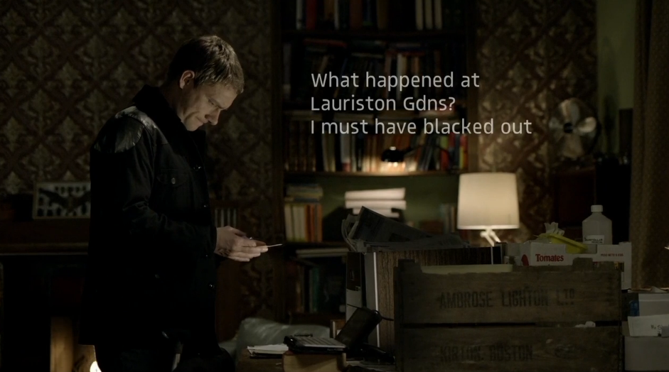
In our lesson today, Ettie and me experimented with adding text to our footage, as the shot of the text isn't quite clear enough to read for everybody. 

A choice that we made was how the text appears - we went with the 'typewriter' effect which meant that the characters appeared individually (as they would appear when writing a piece of text). 
Another decision was the style i.e. font, colour, size. Due to the background being very light, we tried both black and white. We will try a few different varieties and get some audience feedback. 

A real example that uses this technique is 'Luther'.  They have used a white font because of the dark backdrop, allowing it to stand out more. 
We have yet to decide whether we want the text to appear in a bubble or text box. 

This video explains how post production text works. 
(http://vimeo.com/103554797)


Changing the text can be done on 'controls' - you can change the speed at which it appears, the spacing of the text, font, colour etc.

You can preview it by going on the 'video' tab, and then drag it on when you're happy with it.