Friday 19 December 2014

Our Short Film


Here is our short film: we still have to edit a few areas of this until it is fully finished. But we have posted this here to gather audience feedback for when we return from the Christmas break.


------------------------------------------------------------------------------------


This is our final version of our film with improvements made from the audience feedback we gathered!


------------------------------------------------------------------------------------

FINAL FINAL VERSION!!


DROP Review

This is our Little White Lies review.

Below is the transcript for the review:


This film is ambiguous on a number of levels  The title 'Drop' cleverly refers to the death of a character and the action of spiking a drink. . In addition, this is no ordinary 'who dun it' film because of the unexpected antagonist.

The short film genre is usually characterised by a minority of settings. However Drop manages to overcome this sometimes simplistic limitation and includes a plethora of contrasting locations which adds to the complexity of the story line. One location, the R.A.C Country Club in Epsom, mirrors the motif of the film perfectly: the upper middle class characters display opulence, affluence and wealth which is also denoted in the ‘Downtonesque’ setting. The crime committed in this setting at the country club may surprise audiences as this social class is not usually associated with 'crimes of passion'. On the other hand, more in sync with the short film genre, the cast is limited which allows for the creation of the character’s death in such a short running time. All three characters are executed superbly by Ettie Greenwood, Joe Willmott and James Garbis (up and coming actors that could really make their mark in the film world during the next few years).

The plot revolves around a complicated and secretive 'love-triangle', in which Rachel (Ettie Greenwood), is extremely guilty, doubtful and inevitably miserable leading to the films unexpected finale. This is skilfully handled by director Rosie Lincoln (also director of the inspiring ‘Life as we know’) who places the plot reveal at the end with the clichéd technique - a flashback, which literally 'makes the penny drop'.

Female director, Rosie Lincoln, is known for her feminist views that are especially reflected in her recent film shorts. Once again, Lincoln creates a strong lead female character, Rachel, who appears to dominate in the crucial love triangle. So, what are the feminist credentials: Rachel is a wealthy, powerful young woman. She emits signs of dominance and control, never being submissive to her man. She is far from the typical dependant female character of the past.  

However, there are alternative interpretations of her character which suggest that 'Drop' instead does not communicate the feminist ideology that others suggest: Come the end, Rachel is seen in a very vulnerable light, as she panics over then death she had subconsciously caused. There is a great debate over whether these feminist values are consciously displayed or not, of which readers can discover more on the 'twitter-sphere' where the heated debate continues to rage.
 ----------------------------------------------------------------------------

UPDATE:

After a few improvements on the justification and page numbering here is our final version:


Final Poster

Tah-Dah!

Thursday 18 December 2014

Little White Lies Review Draft 2

THIRD DRAFT:
This film is ambiguous on a number of levels - Firstly, its' title 'Drop' which cleverly refers to both a death and the action of spiking a drink. Secondly, this is no ordinary 'who dun it' film because of the unexpected antagonist.
A film of this genre - short - usually has a scarcity of  settings, however Drop manages to overcome this sometimes simplistic limitation and includes a plethora of contrasting locations which adds to the complexity of the story line. One location, the R.A.C Country Club in Epsom, mirrors the motif of the film perfectly: the upper middle class characters display opulence, affluence and wealth which is also denoted in the ample setting. However, the crime committed at the country club may surprise audiences as this social class is not usually associated with 'crimes of passion'. On the other hand, more in sync with the short film genre, the number of characters is limited which allows for the creation of the characters death in such a short space of time. All three characters are executed superbly by Ettie Greenwood, Joe Willmott and James Garbis (up and coming actors/actresses, that could really make their mark in the film world during the next few years).

The plot involves a complicated and secretive 'love-triangle', in which Rachel (Ettie Greenwood), is extremely guilty, doubtful and inevitably miserable which leads to the films unexpected finale. This is skilfully executed by director Rosie Lincoln (also the director of the inspiring film life as we know) who places the plot reveal at the end with the clique technique - a flashback, which literally 'makes the penny drop'.

Female director, Rosie Lincoln, is know for her sly feminist views that are especially reflected in her recent film shorts. Again, Lincoln creates a strong female character, Rachel, who appears to dominate in the crucial love triangle. So, what are the feminist credentials: Rachel is a wealthy, powerful young woman. She emits signs of dominance and control, always putting her man second place. She is not the typicaldependant female character of the past.

However, there is contradicting views which suggest that 'Drop' instead does not display feminist ideology: at the end Rachel is seen in a very vulnerable light, as she panics over then death she had subconsciously caused. This is what contradicts the feminist view and could cause the film to therefore take a more neutral perspective.

There is a great debate over whether these values are consciously displayed or not, of which readers can discover more on the 'twitter-sphere' where the heated debate continues to relish.

ANTICIPATION
Ambiguous title that does not give too much of the plot away, very intriguing.

ENJOYMENT
Cleverly crafted with an unexpected twist...

RETROSPECT
...but are the events unrolled too quickly?

Friday 12 December 2014

Little White Lies Review Draft


FIRST DRAFT: 
Drop is the name of this ambiguous film; where the title cleverly refers to two events of the story, the killing of the protagonist and the poisoning of the drink. The film expertly manipulates the reader by creating assumptions that the 20-something female is the antagonist, mischievously having an affair with the bartender. However there is a subsequent plot twist which leads to a malicious attempt to end the love triangle, ultimately ending with a death. The director, R Lincoln - who also created the inspiring film life as we know - denotes this by placing the plot reveal at the end with the clique technique - a flashback, which literally 'makes the penny drop'. This challenges representations in society: where the assumed antagonist is discovered to be the innocent. And of course this happens very intimately, as the nature of the film is short.

A film of this type usually has limited settings, but Drop manages to overcome this sometimes simplistic limitation and includes about 5 contrasting locations which really makes the film highlight it's rich storyline. This allows for only 3 main characters where the audience require detailed information about their characteristics during the film. All three characters are executed well by Ettie Greenwood, Joe Willmott and James Garbis (up and coming actors/actresses, that could really make their print in the film world during the next few years).

Twisted thoughts about love lead to a surprising conclusion in Drop, with one character completely in the dark as to whats occurring - the innocent party doesn't deserve what happens. The plot gives the observer what they think is a sweet story about a couple who are embracing their youth and living their lives to the fullest by seizing opportunities which wouldn't necessarily be given to the average person. Some of the themes and genres include betrayal, love, lust and tragedy. These are shown through the actions of the young adults. The story involves these young adults who are in a relationship, after organising a drinks date we see the lead up to this, and date itself.


Once settled at home and accompanied by a glass of wine, 'Drop' is a conspiring and compelling film bound to keep you awake. The way in which the director, Lincoln, has staged out this short film, allows the events to play out without the need to stimulate too much lateral thinking. All the same, there is enough captivating elements to keep the enigma running throughout the audiences mind.
-----------------------------------------------------------------------------------------------------------------------
SECOND DRAFT:
This film is ambiguous on a number of different levels - Firstly, its title which cleverly refers to both the death and the action of poisoning a drink. Secondly, where the film intelligently misleads its' audience into expecting a different antagonist, creating a 'who dun it' style film.
A film of this genre - short - usually has a scarcity of  settings, however Drop manages to overcome this sometimes simplistic limitation and includes a plethora contrasting locations which really makes the film excel by it's rich storyline. One location, the R.A.C Country Club in Epsom mirrors the motif of the film perfectly: the upper middle class characters display opulence, affluence and wealth which is also denoted in the building. However, the crime caused at the country club may 'turn a head' to viewers as this class is not usually associated with 'crime of passion'. On the other hand, more in sync with the short film type, the characters are limited where the audience require detailed information about their personalities during the film. All three characters are executed well by Ettie Greenwood, Joe Willmott and James Garbis (up and coming actors/actresses, that could really make their print in the film world during the next few years).
The plot follows the relationship of a couple whereby one of them is silently unhappy whilst trapped in a 'love-triangle'. Lincoln denotes this by placing the plot reveal at the end with the clique technique - a flashback, which literally 'makes the penny drop'.

By having the female director R. Lincoln - who also created the inspiring film life as we know - this film could be argued that it emits a feminist ideology; through the power that the female character holds whilst being the dominant participant in the crucial love triangle. There is a great debate over whether these values are consciously displayed or not, of which readers can discover more on the 'twitter-sphere' where the heated debate continues to relish.

Yes, the film is feminist: at the start of the film, the women is molded into a character ideology that signifies her power, wealth and dominance. She always puts her man second, and tries to avoid light hearted 'time filling' conversations. This therefore shows feminism as the women is seen as the leader, and not clinging on to her man dependably like so many films nowadays that take the stereotypical ideology.

No, the film is not feminist: but what about the ending? Where the female is seen in a very vulnerable light, as she panics over then death she had subconsciously caused. This is what contradicts the feminist view and could cause the film to therefore take a more neutral perspective.

Once settled at home and accompanied by a glass of wine, 'Drop' is a conspiring and compelling film bound to keep you awake. The way in which the director, Lincoln, has staged out this short film, allows the events to play out without the need to stimulate too much lateral thinking. All the same, there is enough captivating elements to keep the enigma running throughout the audiences mind. It is a must see for short film fanatics.

Poster

Me and Ettie have taken features from both our original designs and combined them to make two new ones. We chose the image from Etties as it had more conveinient space, in which we put the text from my poster (as we liked the style and design slightly better)


In this one, we darkened the whole image to create a more negative feel to the film and allow the white text to be seen still (as the motion blur didn't look very good in black). The first poster we used a vignette affect (easier to see if you click to enlarge the images) to allow the central part and the characters to have more light and the outer still dark to show up the text.

Thursday 11 December 2014

Initial Poster Design


This is my first inital design for our film "'Drop'. I will get some audience feedback to see where I need to improve; I'm going to start by adjusting the title, as it doesn't quite fit at the moment i.e. size and placement.
  
  • I have used the same font on my poster as we have chosen in the titles of our film, to create synergy and a link throughout. 
  • The text is all justified making it look a lot neater i.e. the title 'Drop' and the names shown.
  • I have edited an awards logo to go onto the poster; to make it look more authentic, as this is a typical film poster convention.
  • This is the same for the reviews - but I havent yet put who they are quoted by. 'Little White Lies' would probably be appropriate as they have a similar target demographic to our short film. 
  • I turned the opacity level of the billing block down and placed it parallel alongside the bottom of the poster. (from looking at existing posters, this is where it's normally positioned). 
  • The vignette affect that I have added to the poster design gives a slight darker feel to the film.

Monday 8 December 2014

Little White Lies - Target Audience

From looking at several copies of the magazine 'Little White Lies' a clear target audience can be established. 


The cost of the magazine is the first indication as to who would buy and read this magazine - £3.95 for a magazine is fairly expensive compared to some magazines priced at £2 (magazines such as 'Heat' which are more disposable). This would therefore mean that the demographic for the magazine would consist of upper and lower middle class people i.e. professionals/semi professionals with a good standard of living. 

In terms of Psychographics, I think that the audience would have a lot of free time and enjoys activities such as the arts - and possibly culture too as a lot of independent films are presented in the magazine. Also people who have an opinion on films and like to discuss them as opposed to just watching them as entertainment. 

The design and style of the magazine also demonstrates the audience likely to buy the magazine; the cover has a matte finish and the artwork/imagery normally includes detail which looks into the feature film suggesting a lot of knowledge and time spent on the magazine, and therefore an audience that are perhaps more professional. 

The modern designs also suggest a youthful audience, as it would most likely appeal to them more. I would say between 18 and 35 years. Going not much lower than 18, as at this age you are able to start having a reliable income. 


Re-draft Poster


Here is my second draft of my poster where I made changes according to the improvements I was given beforehand.

Thursday 4 December 2014

Conventions of 'Little White Lies' Magazine Reviews


Photo copies of work done in class - annotating conventions


In lesson we looked at a Little White Lies film review and labelled all the conventions the ones I found were:
  • The image is always in the same place
  • The title is bold and centred (different font than the main text)
  • The film facts look like a billing block - also centred
  • There are 3 columns with roughly 450 words
  • The first letter of the review is bigger - Drop capital
  • The rating section is in the area of the last column and denotes 3 sections: Anticipation, Enjoyment, In Retrospect. (Only justified to the left)
  • The main text is justified left and right
  • The image and the text is justified and equidistant to the edges on every side
  • The page number is written in 3 digits
  • The word review is placed at 180' at the outside part of the page
  • The title is written as the format: date, month
  • The writers name is placed at the end of the review in capital letters
  • Italic, bold and capital letters are used in specific places.

Click to enlarge


After looking at the article in class, I searched up other articles to check that all conventions were consistent - this was true. Therefore I will pay close attention when creating my LWL review to make sure that I create a piece that looks authentic of a Little White Lies review!


Tuesday 2 December 2014

Audience Feedback on my Poster

I asked my sister Bethan (17) to look at my poster when home and I filmed her saying what she liked about it and what she thought needed improvements. Here is the video:


She said the things I need to improve are:
  •  To get rid of the red area created by the street lamp reflection on the trees
  • And look into using a different font, which further means also changing the font on the film.
I shall make these improvements next time I am in the editing suite so I can create the most successful poster possible which would suite what the audience would like. 

My Poster Draft

Click to enlarge...


Here is my first draft of my poster. And here are some of the main things I did to create my poster:
  • I darked the original image to fit with the negative tone at the end of the film
  • I put the film title in the empty space of the image - the sky- and made sure it was the more significant part of the poster.
  • I put the main actors underneath the title for audience reference
  • I placed the title in the top left because the female character is the antagonist and this could be subtly hinting that she may be involved in the death.
  • I put the reviews and rewards in the top right corner in the other empty space.
  • The billing block is at the bottom as it is not the most significant part of the film.


How to create a vignette effect on Photoshop


Begin with opening the image that you want to add the Vignette effect to onto Photoshop.


Select the marquee tool on the side bar on the left - I've used the rectangle one. 
Also change the feathering so that the edges are softer and not to harsh.


A dashed/dotted line will appear over where you have dragged the shape (where you want the vignette to be).


So far the marquee tool has selected the middle of the image, so to select the outer part, click select on the top toolbar and then click inverse (or shift, command and i)


It's now selected the outside of the image with slightly curved edges to make it a bit more subtle.


With the area still selected, click on the little sun icon on the adjustments section on the right hand side, which will bring up the levels for brightness and contrast.


You can change the levels until you reach the intensity that you want for the image.


Thursday 27 November 2014

Where we are at...

Today we edited again on our short film and so far we have:
  • Put all the footage on to final cut pro
  • Added some music
  • Added video transition
  • Cropped and cut shots
  • Started to edit the colour in some shots
  • Added some of the sound from the microphones
However, we are continuing to edit the small details of our film. I we successfully pay close attention to detail I feel we will have a more successful final film as all the shots will fit together smoothly and will look very professional-like. To get this overall finish this means that we will have to continue to edit well and do this in and out of lessons. 

Tasks we need to do towards editing:
  • Finish colour alterations and make sure that they work together with the shots either side
  • Add foleys where necessary
  • Continue to add the sound from the microphones on to the footage
  • Adjust the sound levels throughout
  • Add a non-diegetic soundtrack in certain scenes *see note* (the restaurant and at the end)
  • Continue to edit in detail
After we have done this we will hopefully have a successful end product.

___________________________________________________________________

Non- Diegetic Soundtrack - NOTE

For a while we have been thinking about asking someone to create a soundtrack for our film: this is because the music on the royalty free websites do not suit our film. Therefore if we can find someone to help us with the music as it would fit more parallel with the film and I feel we would achieve better results with this method.

'DROP' Titling

Today as a group, we started to look into our titles. 

We previously filmed the pill dropping into a large container which we wanted to incorporate the text into. Originally we had the idea of having the 'O' as an image of the pill; however due to the position of the pill in the water, it didn't sit in the right place for the frame to allow the other letters to fit. 
 
Letters appear slightly slanted under the pill.

We then decided to have the letters appear as the pill has dropped and risen back to the surface (demonstrating that the 'drop' is associated with the pill in some form). 

Having it appear in a straight line beneath the pill was unrealistic as, when in water/liquid, things aren't in a uniform pattern. Because of this I suggested that we change the letters so that they were all slightly rotated and staggered. 

Wednesday 26 November 2014

Slumdog Millionaire - Poster Analysis

Media Language:
The 'Slumdog Millionaire' film poster.


Several aspects of the 'Slumdog Millionaire' poster help to suggest the theme and story of the film. 

Beginning with the characters:
  • The two characters, male and female, are standing close beside each other with the girls body turned inwards, implying a close bond between them.
  • Both of them have elated facial expressions and are smiling, demostrating their happiness.
  • The womens costume suggests her ethnicity and therefore perhaps the location of the film. 
The colours used throughout the poster further contribute to the feeling of 'happiness' - they are all very bright, which connotes a sense of excitemen. The colour orange is very prominent which is associated with traits such as success and energy. (click for colour associations/meanings).

Representation and Audience


Paint used at Diwali.
As mentioned before about the womens clothing, the colours surrounding her also help to represent her background. Mumbai (where the film is set) celebrates the occasion of Diwali, which involves a lot of colour and light, so the colours used are very representative of her background. 


'Slumdog Millionaire' is rated at a 15 because of its strong language and violence. 
The poster also shows a multiple choice question (as featured on the game show, 'Who wants to be a millionaire'. This context of gambling for money, may not be appropriate for certain religions i.e. some Christians disapprove of gambling. It also shows the characters to possess quite adventurous personas. 

'A film by Danny Boyle'; Boyle is a well know present film director so the film would perhaps be more appreciative by a modern day audience. 

Genre:
The multiple choice question asks: "what does it take to find a lost love?" 
This implies that the films theme is based on love and having to make choices; connoted by the several options listed i.e. money, luck, brain power, destiny. 

This also acts as a tagline which is in the typograohical style of the tv show: 'Who Wants to be a Millionaire' which allows the audience to associate the film with money and the idea of a gameshow being a major part of the plot.


Typical Conventions 

The layout and composition of this poster is very simple but makes it clear. The main text of the title is placed slightly off centre to allow room for the image. The title is justified and cleverly incorporates the directors name as to create a clean look.  

The type is all in upper case to really put emphasis on the contrast between 'slum' and 'millionaire'.

The quote by 'News of the World' is also show in capitals, with some of the type in a larger font. This is to draw attention to the importance of the key words and promote the film.

The billing block is placed at the bottom of the poster and compliments the design as it takes the same layout. 


Poster Analysis - 'The Imitation Game'

Click to enlarge

Mise en Scene/ Media Language:
Firstly, the costume that the character in the poster wears seems dated therefore suggesting that the film is set in the past. After looking at the IMBD website my initial thoughts about a film set in the past were true, as this film is set around the 2nd world war. This context therefore explains the slogan: "Behind every code is an enigma" where enigma is a sophisticated term to explain mystery and questioning. In the world war, messages would be written in codes by each side to stop the other side from finding out their secrets. However there were some events where the British tried to 'crack' these codes; this is what I think the slogan is trying to hint at.

The code cracking motif is also demoted in the textual graphology in the poster: the image is layered with lined up circles and in some of these circles appear letter. I feel that this design looks code-like and therefore further hints at the code breaking theme.

The title of the film does not follow conventions that I have seen in the other film posters that I have followed. In this poster the title is one of the smallest elements, contrasting with the others which have bold and large titles. Therefore it can be hard for the viewer to notice the film title. However this would have been a conscious decision and not by accident where the creators could have thought that the other aspects of the poster were more important and that the reader would be able to find the title easily once reading the slogan (as the eye is drawn down to where the title is). Nevertheless, the title is still a contrasting colour which makes it still somewhat significant.

Representation:
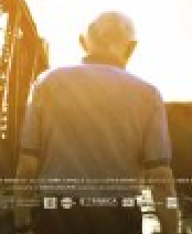
Other version of the poster
Benedict Cumberbatch is the actor featured in the poster. I feel that the creators would have chosen to place him in the poster as he well known to the public. This means that fans of Cumberbatch will be more likely to watch the film, along with others who know of this actors success, therefore making the character a representation of the success of the film. This is also why a close up shot is placed of him so the audience can identify the actor easily, plus he is making eye contact with the camera which looks as if the poster is looking straight at its audience (a persuasive technique called Synthetic Personalisation - Norman Fairclough). I also found an alternative poster with Keira Knightley as the character in the poster for the same effects. This is an example of Dyers 'Star Theory' where famous people are placed in the media to persuade audiences.

Cumberbatch's facial expressions make him seem worried which could translate to a meaning of him being nervous about the code breaking. However as he is on the main poster this could suggest he is a protagonist rather than an antagonist. Also as the actor usually plays protagonists in films the audience know him as a good character and would be pleased to see him do the same in this film.

Audience:
From looking at the BBFC website it is evident that the rating of this film is a 12A for the following reasons:
  • Reference to sexual activities
  • Includes mild language e.g. "bloody"
  • Scenes of mild violence - A man being punched
  • Characters seen to be smoking
However, like 'Before you know it' I feel that the actual audience who will watch the film would be older than 12. This is because I think the characters are mostly adults and it is based in the world war where only older people would have a good knowledge about the event. Therefore I feel the film will attract people aged 16-40 as these people will know more about the world war, but will also be interested in watching a film with characters in their 20/30's. 

I feel the social class of the audience will be B-C2 as these people have a disposable income to go watch a film and will be able to relate more to actors who are represented as middle classed.

Genre: 
The IMBD website states that the genre of this film a Thriller-Drama which is a sub-genre. I feel that this is connoted in the poster as the slogan hints that the characters will be searching for the code answer, making it a drama. But also as the film is set in the world war some negative and disturbing scenes may be present (for example death) which makes the film more like a thriller

The lighting on the actors face suggests a serious tone as its is realistic and looks natural, therefore mirroring the genres denoted. On the other hand the characters facial expressions are also serious which helps to further denote the genre.

These semantic codes (Rick Altman's theory) also support Steve Neales theory of Repetition and Variation as they link to the genres denoted, but the variation is the two genres put together in the film.

Tuesday 25 November 2014

Four Weddings and A Funeral - Poster Analysis

Media Language
Unlike the majority of film posters, Four Weddings And A Funeral doesn't comply with all conventions i.e. the title isn't shown in capital font but more of a handwritten style. 
The text is also shown in Pink, connoting love, perhaps more of a 'crush' or something that he can't have - red would be a more suitable colour to suggest passionate love. 

The props shown in the image also help to portray the genre:

  • The sheep is very abstract, creating enigma and comedy (why is there a sheep at a wedding?) 
  • The amount of people gathered around the piano demonstrate chaos 
  • The vicar/priest pushed to the end shows a chaotic environment, he doesn't appear to be very involved. 
The poster is made up of a white background with the other features layed on top. The colour of white and the amount of blank space suggests that it is a lighthearted film, as white is a very neutral colour. It can also be associated with innocence and weddings so fits well with the theme and content of the film. 

The camera shot used for the image is very level and all the characters are shown at the equal distances from the camera, suggesting that it is a 'cheery' feel good film, a neutral shot. 

Genre:
The style of writing (a semantic code - Rick Altman's Theory of Genre) also conveys the humour and comedic genre, as it is accompanied by a heart with an arrow; the titling is somewhat more 'fun' than typical titles to enable the viewer to have an understanding about the film. 
The colours used in Romantic films is typically reds and pinks as they connote love, therefore supports Steve Neales Theory of Repetition  and people can associate the feature with the genre.  
The image together with the title immediately suggest that this is a Rom-Com film as it tells you there will be a wedding, and the props such as confetti being thrown reinforce that.

Audience:
This film is rated at a 15 certificate due to strong language and moderate sex references.
The name of the film tells you exactly what the film is going to include and for people under the age of 15, they may not fully understand some of the concepts. This is why i feel the target audience could be genralised to 15 years upwards. 

Some of the Actors such as Rowan Atkinson and Hugh Grant, would be more relatable to a slightly older audience such as 35-50 and as would the concepts of weddings and funerals. 

I think the social/class band of B-C2 would be appropriate but could also include people within A or even D. This is because despite it being an independent film, it became very popular meaning that the film would appeal to a variety and would be shown in cinemas too, unlike many small budget independent films. 

Representation:
The imagery used in the 'Four Weddings and A Funeral' poster easily shows the characters as they are all showed lined up. 

The character on the far right is presented as somebody who is ecstatic, shown by his body language; the jump itself implies that he is celebrating something, and the way his limbs are reaching out shows he is supportive and happy - and so is represented to be an excitable man.  

The Women to the left wears a yellow dress, demonstrating perhaps an extravagance to her persona. Her facial expression i.e. a pout, implies she is a women with a strong personality and very feminine, a bit 'sassy'. 

Poster Analysis - 'Before You Know It'

Mise En Scene/ Media Language:

The main colour denoted in this poster is orange: according to colour-wheel-pro the meanings of orange are
  • Energy
  • Happiness
  • Creativity
However, further down the website says that the gold-orange colour connotes wisdom and wealth. I think this is appropriate as gold-orange tones are present in this poster.

The colour also matches the character in the poster. He looks elderly and therefore could have a breath of knowledge (wisdom), but his wealthiness is not evident yet to the audience. This is because he is not facing the camera and therefore creating restricted narration. However, 'your golden years' relates to the elderly meaning this further links the golden colour to the character.

Representation:
The character in the poster seems as if he is a protagonist as there is high key lighting and his posture is neutral. But when looking at the IMBD website for this film I discovered that this film is about 3 homosexual males. The way that the man is represented in this film does not fit the stereotype of homosexuals, meaning that this film could be trying to change the audiences expectations on the gay society. I think this is why then the man is not facing the camera as the creators are trying to denote to the audience that the man could be anyone and they will have to discover his identity when watching the film.

Also, when thinking about context, the older generation generally are not so comfortable with homosexuality as they grew up in a society which was more religious (before secularisation) and disagreed with homosexuality. Therefore this film may be trying to change the view of the older generation especially after recent events supporting homosexuality e.g. The Gay Marriage Act 2013 (which was when the film was made).

Audience:
I could not find any age ratings for this film, however after looking at the synopsis, I feel the film would either have a 12 or 15 age rating. This is because the film does contain 'drama' elements which could possible display strong language. But I feel the majority of people who would watch this film would be aged 30-60 as this film looks more suited to an older generation, and not young teens who would be more interested in comedy. Also at the character is elderly, older audiences would be able to relate more to the characters in the film.


I feel that the social class that the viewers would be in is B-C2 as this film would be available to those with a leisure income and as it is an independent film, it would be unlikely to feature on and deals in a supermarket.

Genre:
According to the IMBD website, the genres of the film is Biography and Drama, meaning that this film is  a hybrid. However, unlike other film posters that I have studied, e.g. This Is England, the genre is less noticeable when looking at the film. The biography element could be hinted at the camera being placed behind the man as this gives the impression that it is following him, therefore following his life - which biographies do.

Conventions in Detail:
  • The title is a sans-serif font which is the norm for more film titles. It is simple which could connote a simple storyline in film
  • The awards and the reviews take up a lot of space on the poster to highlight to the audience of the films success.
  • All the text is layered on top of empty and unused space in the poster to allow the main part of the photo to be seen easily and to avoid a cluttered effect.

Monday 24 November 2014

Poster Analysis - Brighton Rock

The names of the main actors in the film appear to be secondary to the title. They are positioned just above the title in a small type - however they're still in capitals and bold, to show their importance. 

The reviews and text is justified to add structure and are placed along the top of the poster as it draws attention to it.

The images of these actors appear alongside on the poster and appear to be in character, shown by their facial expressions, and positioning on the poster i.e. lined up, however with the male character appearing central to the composition and also slightly forward (shown by his layer being brought forward, causing him to overlap the other female).

Representation:
As previously said, mise en scene helps to create the persona and representation of the different characters shown. 
The male character is shown to be central in the composition and pulled slightly forward. This suggests that he is perhaps the person in charge (whether this be as an antagonist, we don't know) and has more authority and status.

His formal attire further demonstrates the status he possesses -  the tie, along with the long coat, and buttoned jacket, shows a professional look to whatever he appears to be doing. The dark coloured theme to his costume could connote several things: a dark side to him i.e. the antagonist and also a formal/seriousness to his character.

The other two female characters shown on the poster appear to oppose each other. This links with the Narrative Theory proposed by Claude Levi-Strauss. 

It isn't entirely obvious on the opposition however I think it could show good and bad and also some sort of envy. Helen Mirrens Character on the left appears appears to be running for something (shown by her body language) and her facial expressions show a look of concern. Enigma is created as the audience are left to ask why and what she is running for; is it following the man? Does she work with him? And further, is this why the other female character (right of the man) is shown to be giving her a look (facial expression) of disapproval and disgust?

Genre:
From looking at the poster, the audience can assume that it is of a thriller genre, this is backed up by the IMDB website, which states that it is crime/drama/thriller. This is known as a Hybrid Film as it includes multiple genres. 
There are a few semantic codes (Rick Altmans theory of Genre) that connote the genre:

  • lighting - this is low key which conveys a 'dark' theme
  • the shadows created by the 3 point, and key lighting help connote eeriness. 

Audience:
This film has a certificate rating of 15 due to:

  • Violence and Gore
  • Sex and Nudity
  • Alcohol/Drugs/Smoking
  • Intense Scenes 
  • Profanity
These all make this film suitable to an audience of no younger than 15. This ,I think, is a suitable target audience, as Brighton is often associated with the younger generation so they would perhaps be more interested to watch this film. 
I would however consider an older audience for the film as it is based in the 1930's and therefore would have a greater understanding of the film.