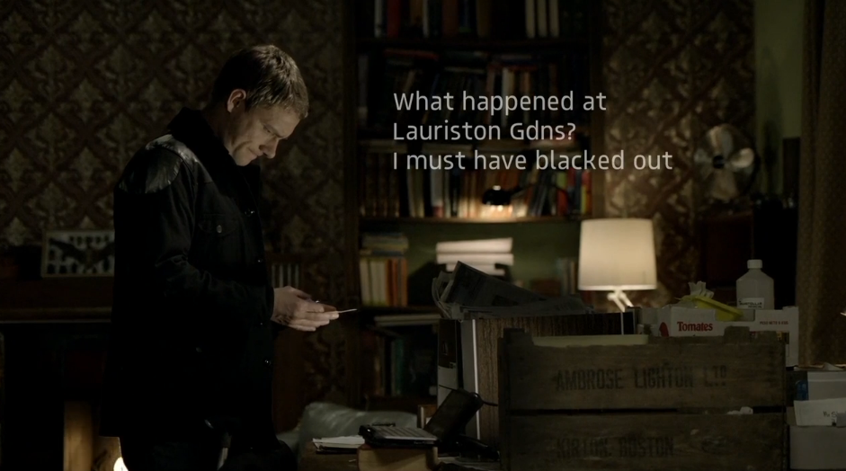
A choice that we made was how the text appears - we went with the 'typewriter' effect which meant that the characters appeared individually (as they would appear when writing a piece of text).
Another decision was the style i.e. font, colour, size. Due to the background being very light, we tried both black and white. We will try a few different varieties and get some audience feedback.
 A real example that uses this technique is 'Luther'. They have used a white font because of the dark backdrop, allowing it to stand out more.
 We have yet to decide whether we want the text to appear in a bubble or text box.
This video explains how post production text works.
(http://vimeo.com/103554797)
Changing the text can be done on 'controls' - you can change the speed at which it appears, the spacing of the text, font, colour etc.
You can preview it by going on the 'video' tab, and then drag it on when you're happy with it.


good informative post
ReplyDelete