Q1: In what ways does your media product use, develop or challenge forms and conventions of real media products?
A) The Main Task
The dominant characteristic within short films, is that it is actually short. From previous analysis of several short films, the plot and story line are cleverly shown within the short space allowed, still with the enigma being able to be raised. This is often done through stereotypes/or stereotype challenging, and characterization.
'Never Forget' is a film that attempts to flip the common stereotype of men being the 'sleezy' gender and the ones to be in the wrong with relationships. The connection between the two characters is shown quickly through the use of parallel cutting(to show that they are happening simultaneously), a convention used in short films - as opposed to a feature length film, that would take more of a build up to allow the viewer to make a relation.
'Never Forget' shows a man figuring out that his partner has cheated on him and done wrong; she tries to cover it up even though he already knows, which I think challenges the gender stereotype.
We as the audience know she has cheated through the flashback used, to show her with another man and her removing her ring.
Narrative Organisation:
A narrative convention of a flashback in a short film, is a simple way to be able to easily show important information. Sometimes this is needed for the audience to understand what is occurring in the story without it being too long. This can then create an omniscient narrative, whereby the audience know more than the characters, which can cause a feeling of suspense. 'Never Forget' uses this to connote to the audience previous events that have taken place in order for the viewer to be on par with the characters. It is often used to allow a deeper understanding of the plot.
We are able to tell if it is a flashback often by effects or certain camera movements used. In 'Never Forget' a slightly blurred and darkened edge (suggesting something abnormal) allows us to realise that it is a flashback as this is common within the film industry. The two different shots of the women (featured below) further suggest it is a flashback as she is appearing in two different scenes.

Steve Neale's Theory of Repetition and Variation can be applied to 'Never Forget'.The Romantic Drama genre (a Hybrid) of this short film is connoted through the presence of a couple and preparing for a date, and the drama being the affair we see through the flashback. This is however then abruptly followed by the man taking his own life by jumping from the building. This can be seen as the 'variation' of typical romances as it is such an extreme and irrational action to take following the news of an affair. This plot twist causes sympathy to be felt for the protagonist.
In terms of our own short film, I think that we followed current conventions quite well. Examples would include narrative, and post production editing.
Because we included a flashback within our film, it doesn't rigidly follow any of the narrative theories.Our story was linear so Todorov's theory can be applied however not the plot:


This medium close up (with the wine glasses in focus) puts significance onto the particular frame meaning the viewer may be able to predict future action.
Levi Strauss' theory of Binary Oppositions in Narrative:
An existing short film that I have analysed was 'Olive'. The female is shown as the antagonist, and the evil of the two, as she doesn't show emotion (through medium close ups) over the fact her partner almost died and was only concerned over the money prospect. On the other hand, we see the disheartened man as the close up shows his look of love and sadness.
This is similar in 'Drop' in the fact Rachel shows a concern over the death of her partner, however she could also be viewed as evil as she had an affair. Joe's character Dylan is the evil character within our film. We tried to not make it obvious that he was the antagonist. We tried to make it subtle i.e. the location happened to be where he worked, the eye contact over the bar, point of view shots.
The camerawork we used in 'Drop' shows some typical conventions:
The films that I researched all used long or extreme long shots, to connote the location of the film to the audience. Within the films, other shot distances are used to communicate meaning. For example, close ups help to portray certain emotions - as shown in 'Brando-ing', 'Olive' and 'The Dinner Party'.
Many films include a long distance shot to establish a location or setting. We used this within our film, to show where they have traveled to and to help connote their wealth.

This panning movement shot of the location, shows the characters arriving and demonstrates their social class.
'Brando-ing' and 'Silent Things' were two of the films that I studied showing this convention:
Lighting:
Typical of thriller genre films, low key and fill lighting is often used to create a darker look or a shadowy feel.
We used quite minimal additional lighting within our film. A lot of the time the weather was unpredictable i.e. a lot of the time it was raining, meaning that we had to make do.
For the beginning cross cut shots of the two characters getting ready, we used a room that already had quite bright ambient lighting with some experiments with a handheld LED light, to show that the male character (James) was still oblivious to what was happening and was continuing with his day (Pathetic fallacy).
With Rachel's character we required no extra lighting; we kept the room she was in quite dull. The props used in the room where all of the same colour shades too which helped to create the atmosphere i.e. no colour, dull shades conveying her darker side.


The contrast between the two locations portrays the characters persona' in different ways. James' room being brightly lit with colour, and Rachel' being dull.
As the film progresses as we get to the interior of the restaurant, we used an LED light and stand to give better low key light due to this being the point in which things take a turn.
The low key lighting also helped to put significance on Joe's character Dylan; the white shirt is prominant amongst the rest of the setting and he is central in the composition which contributes to his importance.
 A short film that I studied that uses both varieties of lighting was 'The Dinner Party'.
Withing this particular shot, you can see that the lighting used has created a numerous amount of soft shadows. The predominant type of lighting within this frame looks to be low key lighting as the table cloth, and props on the table, appear very white in comparison to the shadows on the side of the table cloth and the rest of the surrounding props i.e. the chairs.
This creates a very dramatic atmosphere. The exaggerated shapes of the props in the room help to emphasise that he is alone as they become more prominent.
Sound:
In our short film 'Drop' we used a range of different music. In the beginning shots of the film, an equilibrium state is present so we wanted the music to fit parallel with this. Therefore we chose a non-diegetic sound track that kept its tones and rhythms fairly neutral i.e. no huge diminuendos or crescendos. This therefore fits with typical conventions of short films as the majority attempt to use parallel sound.

Further soundtracks that we used we diegetic (click here to know the difference between diegetic and non-diegetic sound) sound. An example would be the track covered by Ben Howard on the BBC Radio1 Live Lounge. We wanted to use something that would fit with the character - something somebody of that age group would listen to, so we went with this radio station as there demographic states "It should reflect the lives and interests of 15-29 year olds but also embrace others who share similar tastes" ... The songs lyrical content also foreshadows upcoming events i.e. "...hide away with me some more...".
Foleys:
These were something we felt were needed within some of our footage to enhance and emphasis certain actions. One of the most important ones was the restaurant scene. In reality, a restaurant would have a bit of buzz to it and an atmosphere. We were unable to achieve this due to the times we were allowed access to the location. To overcome this we recorded several different conversations with the sound recorder, and lowered the volume levels on Final Cut to have some background noise. This was then accompanied by a non-diegetic soundtrack from the royalty-free music website 'Incompetech'.
Short films that I have studied that would inlcude the use of foley's would be 'Shortcut' and 'A Favour'
Due to 'Shortcut' using an outside location, there are a lot of props that would need sound to be created for, as external factors e.g. the wind, would cause them to make noise.
 One of the most significant props would be the bottle that rolls across. Because the prop is seen to be rolling across paving, it could have easily been created the same way in which we did ours - gathering props to give the correct sound and record the noise using a sound recorder i.e. rolling or pushing the bottle across the ground. This object inparticular would've needed a foley due to other items such as litter making extra ambient noise in the background. The high volume level for the bottle sound helps emphasis the derelict area he is in and his loneliness.
'A Favour' uses two settings to show chaotic family life in their opening. To create the atmosphere of chaos and rushing, the sounds of cutlery and talking is heard.
Plates and cutlery knocking besides each other could be recorded and turned up meaning emphasis on the environment can be conveyed.
A further foley that would've been created is where the man is seen stuck in traffic in his car. As the man turns the radio up, he listens to a current news affair; this would have been created specifically for the film so would therefore would be recorded and then used as diegetic sound on his radio.
 Due to the manic environment within 'A Favour', lapel microphones would have been a good option. These are small microphones that clip onto a piece of clothing for example which can be hidden. They have the advantage of recording sound close by i.e. somebody speaking, which can then be turned up over-top of any other sound layers. Separate conversations within the opening shots of 'A Favour' could be recorded then the ones desired to be heard could be altered.
We used lapel microphones whilst filming 'Drop' as there was a lot of existing ambient sound. The bar scene was where we were sure to use these as we had members of the public there and we wanted to make sure our conversations could be heard. An advantage to using them means we also have a backup in case of any faulty sound issues on the camera. The sound produced is also a lot clearer using a lapel mic, however we needed to make sure we pressed the record button hard enough as sometimes it would need pressing twice, a mistake we had made previously when using the boom mic, so therefore tried out the lapel microphones where the actors where in charge of making sure it was recording.
B) Ancillary Task One

We made the reviews and awards a reasonable size in comparison to the rest of the poster to still keep a professional look. The quote is shown to be from 'Little White Lies' to link it with our review.
 As with 'Brighton Rock' our title has been place to one side of the poster. This is because it was where we had the most appropriate blank space. The only difficulty was the length; four characters wasn't a lot to work with. We did attempt enlarging the spacing between characters, however it didn't look right, hence we created shadows and a motion blur effect on the title to try and lengthen it, but still being appropriate.
The billing block was another feature that we included in our poster. This meant that it had a more professional look to it and all of the directors and actors etc were credited.

Applying Rick Altman to our poster:
We are able to tell if it is a flashback often by effects or certain camera movements used. In 'Never Forget' a slightly blurred and darkened edge (suggesting something abnormal) allows us to realise that it is a flashback as this is common within the film industry. The two different shots of the women (featured below) further suggest it is a flashback as she is appearing in two different scenes.

Steve Neale's Theory of Repetition and Variation can be applied to 'Never Forget'.The Romantic Drama genre (a Hybrid) of this short film is connoted through the presence of a couple and preparing for a date, and the drama being the affair we see through the flashback. This is however then abruptly followed by the man taking his own life by jumping from the building. This can be seen as the 'variation' of typical romances as it is such an extreme and irrational action to take following the news of an affair. This plot twist causes sympathy to be felt for the protagonist.
In terms of our own short film, I think that we followed current conventions quite well. Examples would include narrative, and post production editing.
Because we included a flashback within our film, it doesn't rigidly follow any of the narrative theories.Our story was linear so Todorov's theory can be applied however not the plot:
- Equilibrium - The two characters getting ready to see each other would be seen as the normality here.
- Disruption - This is seen when the audience discover that the women is seeing somebody else (the text she receives from Dylan)
- Confrontation - When her partner collapses, she realises who is to blame for the incident.
It could also be said it is omniscient narration, as the audience know more than one of the characters (James). This occurs when Rachel attends the bar and leaves her partner at the table insisting she goes to the he drinks so that she can see her new lover.
Although 'Never Forget' uses simple cut transitions to show the flashbacks, we used a fade to black to show the step in time. This worked better for ours as it was only one flashback however 'Never Forget' used several cuts to go back and fourth.


Steve Neale's Theory applied to 'Drop':
We tried to follow themes and conventions of a Romantic Drama in our short film.
Within the short film 'Lovefield' Roland Barthes theory of Narrative can be applied:
There are several action and enigma codes, which are things that cause active engagment for the audience and make them question and answer queries - or something that allows us to try and predict the plot by something telling us action will take place.
One of the first enigma codes seen is the black bird; which are symbolically associated with mystery and the unknown, and also darkness.
Although 'Never Forget' uses simple cut transitions to show the flashbacks, we used a fade to black to show the step in time. This worked better for ours as it was only one flashback however 'Never Forget' used several cuts to go back and fourth.
 |
| 3 frames showing the fade to black transition. |
We tried to follow themes and conventions of a Romantic Drama in our short film.
- An obvious couple
- Going out for a meal together
- A dramatic ending of murder
The variation to this would be how Rachel is unaware of the events that have been happening despite her being involved in the affair with the murderer, creating a unique twist to current films of this Hybrid genre.
Within the short film 'Lovefield' Roland Barthes theory of Narrative can be applied:
There are several action and enigma codes, which are things that cause active engagment for the audience and make them question and answer queries - or something that allows us to try and predict the plot by something telling us action will take place.
One of the first enigma codes seen is the black bird; which are symbolically associated with mystery and the unknown, and also darkness.
The knife stabbing into the ground is an example of an action code as it can help to predict the plot - it could connote violence to come ahead. the bloody material may mislead somebody to think that rape or violence has occurred.
Enigma and Action codes included within our short film 'Drop':
Here are some of the action codes within our film

This action code allows the audience to know that there may be something to follow in relation to these to characters and that he has some significance to later events.

This action code allows the audience to know that there may be something to follow in relation to these to characters and that he has some significance to later events.
The titling of 'Drop' foreshadows upcoming events and allows questioning over the rest of the film due to the pill, therefore building enigma.
This medium close up (with the wine glasses in focus) puts significance onto the particular frame meaning the viewer may be able to predict future action.
Levi Strauss' theory of Binary Oppositions in Narrative:
An existing short film that I have analysed was 'Olive'. The female is shown as the antagonist, and the evil of the two, as she doesn't show emotion (through medium close ups) over the fact her partner almost died and was only concerned over the money prospect. On the other hand, we see the disheartened man as the close up shows his look of love and sadness.
 |
| A POV shot to show the personal relationship. |
The camerawork we used in 'Drop' shows some typical conventions:
- pans of long shot to show the location
- a varying distance of shots to show emotions
The films that I researched all used long or extreme long shots, to connote the location of the film to the audience. Within the films, other shot distances are used to communicate meaning. For example, close ups help to portray certain emotions - as shown in 'Brando-ing', 'Olive' and 'The Dinner Party'.
Many films include a long distance shot to establish a location or setting. We used this within our film, to show where they have traveled to and to help connote their wealth.
This panning movement shot of the location, shows the characters arriving and demonstrates their social class.
'Brando-ing' and 'Silent Things' were two of the films that I studied showing this convention:
 |
| An establishing shot from Brando-ing showing the location. |
 |
| Silent Things follows the convention with an extreme long shot. |
Lighting:
Typical of thriller genre films, low key and fill lighting is often used to create a darker look or a shadowy feel.
This Video shows how high and low key lighting can be used to create different effects:
We used quite minimal additional lighting within our film. A lot of the time the weather was unpredictable i.e. a lot of the time it was raining, meaning that we had to make do.
For the beginning cross cut shots of the two characters getting ready, we used a room that already had quite bright ambient lighting with some experiments with a handheld LED light, to show that the male character (James) was still oblivious to what was happening and was continuing with his day (Pathetic fallacy).
With Rachel's character we required no extra lighting; we kept the room she was in quite dull. The props used in the room where all of the same colour shades too which helped to create the atmosphere i.e. no colour, dull shades conveying her darker side.
The contrast between the two locations portrays the characters persona' in different ways. James' room being brightly lit with colour, and Rachel' being dull.
As the film progresses as we get to the interior of the restaurant, we used an LED light and stand to give better low key light due to this being the point in which things take a turn.
 | |
| Low key lighting used within the restaurant scene. |
 A short film that I studied that uses both varieties of lighting was 'The Dinner Party'.
 Withing this particular shot, you can see that the lighting used has created a numerous amount of soft shadows. The predominant type of lighting within this frame looks to be low key lighting as the table cloth, and props on the table, appear very white in comparison to the shadows on the side of the table cloth and the rest of the surrounding props i.e. the chairs.
This creates a very dramatic atmosphere. The exaggerated shapes of the props in the room help to emphasise that he is alone as they become more prominent.
Sound:
In our short film 'Drop' we used a range of different music. In the beginning shots of the film, an equilibrium state is present so we wanted the music to fit parallel with this. Therefore we chose a non-diegetic sound track that kept its tones and rhythms fairly neutral i.e. no huge diminuendos or crescendos. This therefore fits with typical conventions of short films as the majority attempt to use parallel sound.
Further soundtracks that we used we diegetic (click here to know the difference between diegetic and non-diegetic sound) sound. An example would be the track covered by Ben Howard on the BBC Radio1 Live Lounge. We wanted to use something that would fit with the character - something somebody of that age group would listen to, so we went with this radio station as there demographic states "It should reflect the lives and interests of 15-29 year olds but also embrace others who share similar tastes" ... The songs lyrical content also foreshadows upcoming events i.e. "...hide away with me some more...".
Foleys:
These were something we felt were needed within some of our footage to enhance and emphasis certain actions. One of the most important ones was the restaurant scene. In reality, a restaurant would have a bit of buzz to it and an atmosphere. We were unable to achieve this due to the times we were allowed access to the location. To overcome this we recorded several different conversations with the sound recorder, and lowered the volume levels on Final Cut to have some background noise. This was then accompanied by a non-diegetic soundtrack from the royalty-free music website 'Incompetech'.
Short films that I have studied that would inlcude the use of foley's would be 'Shortcut' and 'A Favour'
Due to 'Shortcut' using an outside location, there are a lot of props that would need sound to be created for, as external factors e.g. the wind, would cause them to make noise.
 One of the most significant props would be the bottle that rolls across. Because the prop is seen to be rolling across paving, it could have easily been created the same way in which we did ours - gathering props to give the correct sound and record the noise using a sound recorder i.e. rolling or pushing the bottle across the ground. This object inparticular would've needed a foley due to other items such as litter making extra ambient noise in the background. The high volume level for the bottle sound helps emphasis the derelict area he is in and his loneliness.
 'A Favour' uses two settings to show chaotic family life in their opening. To create the atmosphere of chaos and rushing, the sounds of cutlery and talking is heard.
Plates and cutlery knocking besides each other could be recorded and turned up meaning emphasis on the environment can be conveyed.
A further foley that would've been created is where the man is seen stuck in traffic in his car. As the man turns the radio up, he listens to a current news affair; this would have been created specifically for the film so would therefore would be recorded and then used as diegetic sound on his radio.
We used lapel microphones whilst filming 'Drop' as there was a lot of existing ambient sound. The bar scene was where we were sure to use these as we had members of the public there and we wanted to make sure our conversations could be heard. An advantage to using them means we also have a backup in case of any faulty sound issues on the camera. The sound produced is also a lot clearer using a lapel mic, however we needed to make sure we pressed the record button hard enough as sometimes it would need pressing twice, a mistake we had made previously when using the boom mic, so therefore tried out the lapel microphones where the actors where in charge of making sure it was recording.
B) Ancillary Task One
i) Film posters you have analysed
Typical conventions I have noticed within film posters:
- Billing Block - a legal requirement containing any such copyright information
- Justification - both text and imagery are lined up to give a clean and professional look t the finished poster.
- Awards and Ratings - shown to promote the film and attract an audience as it gives positive reviews.
- Slogan - not always used, but often to give an insight into the film.
- A release date - to advertise, inform and create excitement about the film.
- Actors/Directors - if big names are involved, it entices a wider audience as they are recognised for doing well in other films.
- Imagery - to connote any information about the characters or film itself, including genre and content.
- Titling - often the largest part of text to appear on the poster and to draw in attention so that it is memorable.
Layout:
Most of the posters I have studied, include the film title being centered within the composition. There is an exception however if the image is significant enough to need more space, for example the 'Brighton Rock' poster.
The billing block mostly appears beneath the title, or beneath anything infact - often at the bottom strip of the poster, whether that be portrait or landscape.
 |
| Billing Block shown at the bottom |
 |
| Title to the left of composition |
The 'Slumdog Millionaire' poster doesn't include the feature of actors names. This is because of the low budget film meaning the actors are most probably upcoming and not terribly well known, hence taking up unneeded space.
With IMBD referring to this film as a Romantic Drama (similar to our short film 'Drop') the poster include certain semantic codes (Rick Altman's theory of Genre) that allow the audience to denote this:
With IMBD referring to this film as a Romantic Drama (similar to our short film 'Drop') the poster include certain semantic codes (Rick Altman's theory of Genre) that allow the audience to denote this:
- Couple shown next to the title
- Body language of the two characters - they appear close together with happy facial expressions showing their bond and the romance part to the hybrid.
- The drama aspect isn't given away through the poster as to surprise.
- females costume demonstrate ethnicity and background.
- bright colours denote happiness and excitement.
ii) Your own Film poster
- We tried to include as many of the typical conventions you would commonly see on a film poster, trying not to make it too crowded. Using the ruler tool on Photoshop we were able to get even space between features.
- For the title of our film, it became difficult to place, in the sense that it is only four characters long, in comparison to many of the short films studied.
- Taking 'Brighton Rock' as an example, the title is quite lengthy meaning it could be experimented with more. With 'Drop' we had to get the spacing just right so that it didn't look too sparse.
- Within the two images here you can see that we had decided to go for a white font over black. This was because we felt that the white ultimately captured attention better as the majority of the poster uses dim colour.

 |
| A draft using black coloured font. |
 As with 'Brighton Rock' our title has been place to one side of the poster. This is because it was where we had the most appropriate blank space. The only difficulty was the length; four characters wasn't a lot to work with. We did attempt enlarging the spacing between characters, however it didn't look right, hence we created shadows and a motion blur effect on the title to try and lengthen it, but still being appropriate.
- The reasoning behind the blurred effect on the title was to create a longer looking font to fill the space more appropriately seen in film posters, and to foreshadow future events.
| A response from our survey about our poster titling. |
The billing block was another feature that we included in our poster. This meant that it had a more professional look to it and all of the directors and actors etc were credited.
Applying Rick Altman to our poster:
- The couple pictured on the poster suggest the romantic genre.
- The females body language i.e. looking away from her partner, suggests she is not engaged with the relationship.
- The location appears grand with the fountain and golf buggies suggesting their upper class.
- The costume demonstrates their wealthy status.
- Grey/dark cloudy sky is relevant to the dark story line and the plot to come.
C) Ancillary Task Two - LWL Review
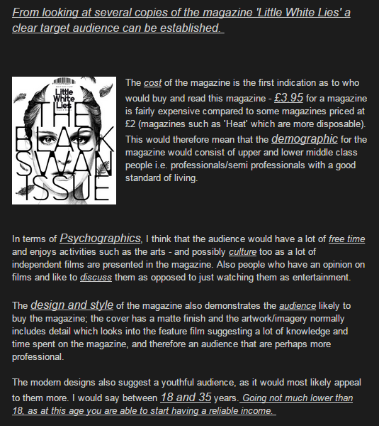
Target Audience: Click the image to view my previous post on Little White Lies Target Audience
Layout Conventions:
- Image always presented in the same place - the top
- The main article type is all justified and of equal distance to the sides
- Page number is 3 digits
- Three part rating placed in bottom right hand corner
- Drop capital is used for the opening letter of the article
- The title is centered and in bold form
- The writers name is placed at the end of the review (in capitals)
- Review presented in 3 columns
Language Conventions:
- Very descriptive and rich articles
- The plot is touched on, but not too much is given away
- In-depth reviews that often raise discussion over issues of the particular film
How we followed these conventions in our review:
Before beginning our review, we decided to split the task into three separate parts so that all of us had a part to take care of... however, when we came together with each other we realised we have repeated ourselves quite a lot.
With this is mind we decided it best for Ettie to continue with the review (trying to combine all of our parts we had each written), as she had begun the opening paragraph. With guidance from our subject teachers and referring to example reviews from the magazine, we were able to write a successful review.
 Language and Layout Conventions within our review:
Before beginning our review, we decided to split the task into three separate parts so that all of us had a part to take care of... however, when we came together with each other we realised we have repeated ourselves quite a lot.
With this is mind we decided it best for Ettie to continue with the review (trying to combine all of our parts we had each written), as she had begun the opening paragraph. With guidance from our subject teachers and referring to example reviews from the magazine, we were able to write a successful review.
- I experimented with several pieces of footage to use as our main image but eventually we settled on a still image as it didn't give too much away about the film, something Little White Lies attempts.
- Along with this, we all created layouts of the magazine to make sure that we got it correct.
 Language and Layout Conventions within our review:
- We incorporated media vocabulary i.e. genre, plot, flashback and setting.
- Formal language complies with the typical magazine conventions, for example, ideology and opulence.
- We kept the original measurements and guidelines as the magazine.
- Three columns with the correct word limit.
- A ratings system included at the end.
- Same font size and typeface.
QI - Short film conventions are a bit on the lean side - refer to the guidelines and try to comment on all aspects. As you say, imagery will be needed.
ReplyDeleteTodorov can be applied to the story but not to your plot because of the flashback used.
You have referred to Todorov and use terminology well in places like omniscient etc, enigma. Barthes suggeste4d that Enigma was a code used to communicate. You can refer to him. There are a lot of theorists regaerding narrative that you could refer to - see your summer term notes on Moodle.
poster - rating attract certain audiences - A LWL reference attracts a different audience to say The sun.
With your ancillary products, a lot more required on how you have illustrated the conventions in your own work.
Its a start on Q1 Rosie, although a lot of work still to do.
Ask if you need any help.
Image connote info regarding genre, content etc, setting as awl as Character type. Mostly through Mise en scene but also through camera work (angles for instance)
Your poster does convey imp info about what the film is about, it genre, the setting, something about the characters (their class perhaps( and so on.
Very good Rosie - incredibly thorough
ReplyDelete