Q3: What have you learned from your audience feedback?
Firstly our target audience can be found on this post: click here Therefore when looking into audience feedback, we therefore looked into asking people within our target audience.
One of the first pieces of audience feedback that we did was to ask people on survey monkey on what they thought of our synopsis, character, title and location. Here is the blog post about it (click here). We felt it was vital that these decisions suited our target audience so after getting good feedback we knew we would be able to continue the planning stage for the film. If anyone had given negative comments about the synopsis we would have acted on them to make sure the film would suit its' audience.
The texting section that we asked feedback on
Throughout our editing process we would sometimes edit whilst our peers would be with us, this allowed us to ask them about how our film looked. Examples of this was when Rosie asked her friend Josh about the texting scene at the start of the film. She asked him about the font, colour and position. We also discussed this within our group and people in our media class so we could attain something that was easy to read, and was obvious that it was a text. Another occasion was when I asked my twin about how our poster looked as she gave me feedback which I acted upon. Click here for the blog post about it. By having this audience feedback we were able to adjust our products to suit the audiences needs and desires.
The audience feedback I gathered about my first poster draft
The poster draft that I asked audience feedback on
Our final poster after audience feedback
Rosie and I then asked our friends on Facebook about our final poster and these are two of the replies we got:
Reply 1
Reply 2
As the people we asked were in our target audience, it shows that our poster would be successful for them. We did however ask them for any improvements but we haven't received any yet.
We also planned to ask final audience feedback on the whole of our film, hence why we posted it before the Christmas break. But unfortunately something went wrong when we uploaded the video to YouTube and the video could not be seen. This means that we will now have to quickly sort this out when we go back to college (as the files are only available at college) and send out the audience questionnaires the same day. We will then gather the feedback and make any quick alterations to our short film before the deadline. It is unfortunate that we could do the surveys now, but I feel that we will still be finished in time if we work quickly. It is important that we gather audience feedback on this as then our film will be at its most successful.
Since returning from the Christmas holidays we have been able to fix our short film and post it on youtube. This meant that we were able to send out our survey for people to anaylse all parts of our work. We chose to use survey monkey as it was free, easy to create, and easy to send to people to fill in. The only downside to it was that we were limited to only 10 questions before we need to start paying for the websites functions. However this was not much of a problem as I just chose more important questions to ask. Here are the questions and responses (click images to enlarge):
As you can tell, we did not get a huge response rate from our survey even though we sent it to multiple people. This is the downside of using surveys to collect data as they usually have a low response rate. However from the responses that were collected, we were able to tell the audiences understanding and whether we needed to improve any areas. From looking at the responses we can tell:
QUESTIONS ABOUT THE FILM
Our audience understand that the black and white editing at the end represents a flashback
We need to make the second texting screen longer so the text can be read: "At the end when it shows the texts, make it longer as it dissapears before I finished reading it."
The audience know that the woman is having an affair throughout: "Yes, when she gets a text saying dylan cant wait to see her, her
conversation at the bar, and the hesitation about going on holiday."
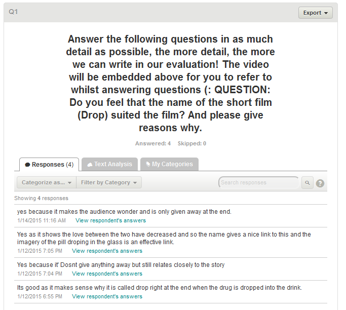
The title 'Drop' suited the film well as one respondent answers: "Yes as it shows the love between the two have decreased and so the name
gives a nice link to this and the imagery of the pill droping in the
glass is an effective link."
QUESTIONS ABOUT THE POSTER
The audience thought the poster worked well: "I like how the colours work well and how the work drop looks like its falling."
The audience though that it mirrored the film: "Yes as the female is looking away so suggests an affair"
QUESTIONS ABOUT THE LWL REVIEW
The audience thought the review looked professional and alike the original LWL material: Yes looks professional and has lots of depth and detail
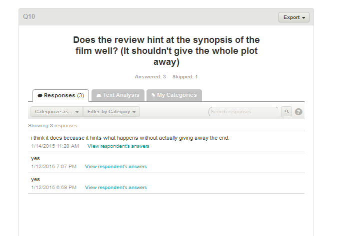
The audience thought the review didn't give too much of the plot away: "i think it does because it hints what happens without actually giving away the end."
Overall I feel that our audience understood our film well and that our ancillary tasks were effective, we will now make changes to any improvements needed.
After getting the audience feedback we then decided to immediately act on it, here is a video where we address the problem that the text could not be read. This video shows the new length of the text which is hopefuly long enough to read!
We also got a survey reply saying that the restaurant scene was too bland:
Therefore we responded to this by adding a non-diegetic royalty free soundtrack to the scene and also addded some ambient noise (we did this by recording people then inserting this into the film at a low level). We feel this helped to add more atmosphere like the respondent requested. click here to watch the section: http://www.youtube.com/watch?v=e3RlrVSiIr4&t=2m39s
Also, here is a timelapse that I made of me and Rosie fixing the sound on our short film:
By having an external view it allowed us to pick up these errors. This therefore highlights how important audience feedback is!
Q2: How effective is the combination of your main product and your ancillary tasks?
I will do a video for this and talk about (this is in note form as when i film I will expand on these points)
how the film is marketed
social media (guerilla marketing)
Viral marketing - word of mouth
free CD give out in newspapers/mags
adverts on Facebook or other social media
use for a portfolio so directors can show their work to big media companies
entering film festivals
How the film links to my poster
same font used in both (Lucinde Grande)
the same setting - the RAC Country club
The same main characters, who are also wearing the same costume as in the film so enables synergy.
How my poster communicates meaning
female character is looking away, connotes a weak relationship?
she is looking at drop, could connote that she is the antagonist (but actually turns out not to be)
Drop's font is blurry with a blurred shadow, could show the films ambiguity or as it looks a bit watery like, could hint at the pill dropping into the water
the review: 'Cleverly crafted with an unexpected twist' allows the audience to know about the twist in the film.
Pathetic fallacy - the sky is grey which suggests negative events in the film.
LWL review
Has a different target audience - students or young professionals who are in the media industry - love film. So, in the review I used media terminology, and wrote in a detailed descriptive way as the audience is knowledgeable about film.
If the review is favourable - good marketing success as those who most love film will see it, including maybe bigger media corporations
If the review is not favourable - would have to use more marketing strategies and maybe appeal at a different audience who don't read LWL eg. students of a different subject or those who are not a student.
the picture in the review is also at the RAC Country club allowing synergy though all 3 pieces.
The review links to the poster as the review shown is from Little White Lies
LWL's target audience merges with ours of the film, viewers will also read LWL's.
When filming, I will add appropriate images to illustrate what I am talking about.
Q1: In what ways does your media product use, develop or challenge forms and conventions of real media products?
A) The main task:
One of the main characteristics of a short film, is that it is short and this was obviously denoted in all the short films that I looked at. The short nature then also means that the plot line of the film must unravel quickly and not like a feature length film where suspicions and enigma can grow in a long space of time. This meant that any enigma raised would have to me fairly obvious and this could have lead to stereotypes being used.
CHARACTERISATION
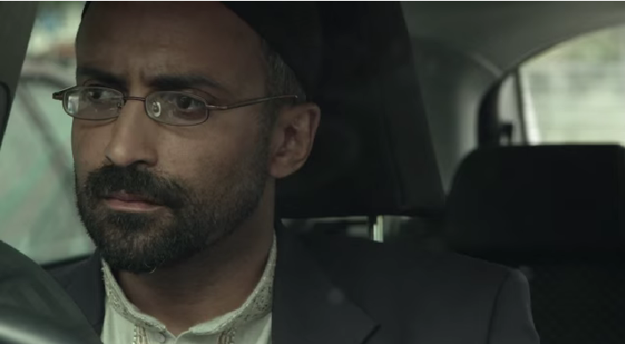
IN SHORT FILMS THAT I STUDIED: Stereotypes were used quite prominently in the film 'A Favour' that I analysed where a Muslim man would have been thought to have committed the terrorist attack. However in the case of this plot, a middle-classed white man actually turns out to be the antagonist but slyly makes the Islamic character set off a bomb whilst unaware. This I feel challenges common use of stereotypes in short films as the assumed antagonist turns out to be innocent. See my original blog post for 'A Favour' here.
The Muslim man
The White man - Antagonist
IN MY SHORT FILM:
I feel we used characterisation well as we managed to create the personality of the female, Rachel, to be deemed as shifty and not 100% committed to the relationship. We did this by getting her to look uninterested in the car and by creating dialogue which denoted her un-interest.
Scene where Rachel displays her
un-interest
By doing the plot twist, the characterisation of Rachel really helped to make the audience feel that it was her who poisoned James. This therefore could have shocked the reader when they found out it was not her, meaning the audience would have been more active whilst watching.
The piece of paper from 'The Black Hole'
SETTING/MISE EN SCENE
IN SHORT FILMS THAT I STUDIED: Another convention of short films is the limited settings/ characters. I feel this is because most short films are created by directors as they start their career so they have a limited budget. This was shown through all the short films that I analysed as they had no more than 3 main characters and the film style seemed to be low budget. However, the directors did seem to make the most of this limitation, for example, in 'The Black Hole' the main prop was in actual fact a large piece of paper with a printed black circle on it. But the director cleverly used this to simulate a teleportal. See my original blog post for 'The Black Hole'here.
The lighting and blue hue white balance
In this film, Mise En Scene was affectively assembled to create an eery setting. The light was high key with lots of shadow which created a more uneasy and mystical tone. It also highlighted to the audience that this was in after work hours, doe to the lack of people/office lighting. Then as the white balance had more blue hues, this could of foreshadowed the unfortunate ending.
Mise en scene also allowed the audience to learn about the charcater:
Costume - He is in a shirt and trousers suggesting that he is at work.
Setting - The location seems office like, hinting towards his job
Facial expression - At the start he seems tired and fed up, hinting at his hate for his job, therefore finding 'the black hole' acts as a sense of escapism from his everyday life.
IN MY SHORT FILM:
One thing that we did do differently with the setting in our short film was to use a larger number of settings. Overall we used 6 different locations to film at including the country club and the pub. This is quite unusual of short films but we luckily managed to do it as members in our group knew the owners/managers of the areas that we needed permission for.
Location 2: Bedroom/house 2
Below are the 5 locations where we filmed:
Location 1: Bedroom
Location 3: Car
Location 4: Country Club
Location 6: Car Park
Location 5: Pub
As with 'The Black Hole' mise en scene also helped our audience to learn about our characters:
Costume - The both wear smart clothing suggesting that they are middle-upper class
Setting - The RAC Country club is for members only, so this highlights their class.
Facial expressions - Rachels facial expressions particularly show the uneasy relationship between her and her partner
Lighting - When the poisoning happens the light is dark which connotes a more eery tone to the film.
Props - The props in the film include, a car, wine glasses etc. These are all common items for middle classed people- therefore cementing their class.
One of the props in 'Drop'
USE OF GENRE CONVENTIONS
IN SHORT FILMS THAT I STUDIED:
Touch - Romantic Drama genre
When looking into the short films genres, I found that most of them had ahybrid genre. I feel this is because the films are so short that they have to include different genre conventions to maintain an interesting and rich plot. For example, 'Touch' had a hybrid genre making it a Romantic Drama; this was because the main plot was a romance as the women remembered her life with her husband, but then it was also drama as it included dramatic event such as her husbands death. This genre was denoted by using Altman's theory where the semantic codes would be:
Marriage CU shot from 'Touch'
The Couple - This highlights the Romantic genre as it is commonly seen in these types of films
Display of love - Touching hands, kissing, marriage and cuddling all create the romantic feel
The Memories - This could be argued that it represents the drama genre as it shows events happening over a long period of time.
The death of her husband - This is the Dramatic part of the short film as it denotes her husband dying by which the audience realise why she is think about her lifetime.
Steve Neales theory of 'Repetition and Variation' is also essential when creating short films: His theory explains how films have to have a 'USP' whilst also conforming to the genre conventions. This then means that the film can gain the greatest amount of profit possible.
Low angle shot after the women finds her
husband dead in 'Never Forget'
In 'Never forget' the Romantic/Mystery/Drama genre was denotes by including a couple, having the date set as Valentines day and the affair. However I feel for this film, the 'Variation' part of Neales theory would apply to the suicidal death of the male protagonist. This is because deaths are not usually what results after an affair so this film takes a more extreme approach to the activity.
IN MY SHORT FILM:
The genre of our short film was a hybrid (like many short films) of romance and mystery. This is because the film had romantic elements for example the couple, and the going out for a meal aspect; But its also has dramatic elements such as the affair and the poisoning making it fit the mystery genre. Therefore I feel that the Romantic-Mystery genre was best suited, especially due to the occurrence that the romantic part doesn't display happy and heart-touching scenes.
Altman's Theory of semantic codes could also be applied to to our film, and they are:
The couple - which is a common aspect in most romantic films (Romance)
The meal out - This is typical activity for couples to do, and in most films it displays the love towards each other.
Props - we used flowers and wine glasses to show the implied date.
Non-diegetic music - We used different music to suggest different aspects of what was happening.
The poison - this fit the dramatic side, as the poison was a disruption in the romantic plot line.
The affair - this fit the dramatic genre as it was a twist in the conventional romantic film.
Body/facial expressions - the women's expressions was shifty implying to the audience that drama may take place in the film.
Where the drink gets poisoned
Steve Neales theory of 'Repetition and Variation' was also applied to our film: Our short film repeated conventions of Romantic-Mystery films e.g. love aspects, a meal and a dramatic event. But the variation was the twist where the girl didn't intend on the death of her boyfriend. This made our film different to those already on the market and if it was to be sold, it would bring something different to an already saturated market: potentially reaching higher sales.
As short films are usually creative and may use new media techniques, Neales 'variation' to a genre aspect may be seen in short films frequently as they are experimental. As our film has a big variation it means that it fits the conventions of short films well.
SOUND IN SHORT FILMS THAT I STUDIED: In 'Just Say Hi' a non-diegetic soundtrack was used connote the meaning of the piece. This was 'Celeste' by Erza Vine. This sound track was parallel to the mood of the film as its lyrics used romantic semantic codes (Rick Altman's theory):
"...The way you looked is still vivid to me,
You're something out of a dream,
Messing with my head,
And I've been looking for you-u-u... "
Here is the short film where the sound track can be heard:
I think this non-diegetic sound track worked well as the lyrics were synchronous to the plot of the film. This is important in short films as the music helps to add depth and subtly allows the audience to know what the characters may be think. Therefore a good music soundtrack could also create un-restricted narration where the audience have an omniscient view of what is happening.
In 'Just Say Hi' it is also evident that lapel mics were used to record a second set of sound. This is because when there is ambient sound - like on a busy road where the film is shot - these mics are needed to hear the characters voices ontop of the road noises.
This is what most professional film makers use to gain high quality sound in their films.
IN MY SHORT FILM:
In my short film the first non-diegetic soundtrack heard is from the royalty free music website incompetech.com. This soundtrack seemed quite neutral with no massive crescendos which suited the beginning where an equilibrium was present. This means that our soundtrack was parallel to the plot of the film. By doing this we fitted the conventions of sound for short films as they too use synchronous/ parallel sound.
We also had sountracks playing diegetically in the film from BBC Radio 1's Live Lounge. This added depth to our film and quite interestingly the songs played suited the mood of our short film. The songs heard were Ben Howards cover of 'Hideaway' which hints at the affair by the lyrics 'Hideaway with me some more..' and the second track was in the car where Sam Smith's 'Stay With Me' is heard. This track hints at James' desire to stay with Rachel whilst unaware of her affair.
Me holding the lapel mic whilst recording
Also, like 'Just Say Hi' we also used lapel mics which helped us get more crisp sound when recording in places with a lot of ambient sound. By doing this it allowed us to obtain a more professional feel to our film whilst fitting in with the conventions of making the sound of the film. The only problem that we had with the lapel mics were that they were large so were sometimes hard to hide in shot. Therefore maybe a boom mic may have been easier for this. You also had to make sure you were definitely recording when using them as in some cases you had to press the record button twice before anything was captured.
EDITING/POST PRODUCTION
IN SHORT FILMS THAT I STUDIED:
In the short films that I looked at editing work was obviously shown in all of the films as this is essential when creating a short film. However some of the films used editing less subtly to communicate a certain meaning.
Little Larry used colour to suggest meaning:
Desaturation in Little Larry
At first the sort film is in black and white which connotes his negativity towards life and as his life (and the colour) is desaturated. Also the lighting has a high contrast which highlights the black and white and could symbolise the difference between what his life is and what he wants. This techniques is used in the majority of the film which enables continuity.
Over saturation in Little Larry
However as soon as Larry finds a partner, the colour in the film is revealed. It seems over-saturated as the colour is vibrant. This creates a massive difference from the previous colour used which could connote his over whelming delight in finding someone who is alike him.
As short films don't have much time to get their message across, I found that using obvious editing really helped to get the message across to the audience like in Little Larry. IN MY SHORT FILM:
We also used colour alteration in our short film but not to as greater extent. We had problems with our camera white balance, meaning that we had to use post production to alter the colour. Here is a before and after of one of the colour correction pieces that I did:
Before colour correction
After colour correction
This post-production work was only very subtle though as we wanted to create a more realist view of the film.
Other post-production work we have done which also feature in other films - highlights that our film fits the conventions:
Shot, reverse shot
Match on action
180' rule
Colour correction
Fades from/to black
NARRATIVE ORGINISATION IN SHORT FILMS THAT I STUDIED:
Lovefield used restricted narration cleverly to position the audience to believe that something else is happening. By doing this the audience's attention was 'grabbed' as they searched in their minds for clues on the event. This is a form of enigma (Roland Barthes)where by the props and camerawork create questions in the audiences minds and this makes them an active audience. This technique is present a lot in short films because they are so short. This means that they have to capture the audiences attention quickly, and enigma is a good way of doing this. Here are some of the 'clues' in the film that may have hinted to the audience that a murder/rape event had happened:
Even though restricted narration was used in the short film, making it hard for the audience to have a omniscience view on the story, the narrative structure was linear. This is because there were no jump cuts or flashbacks and the plot was in the same order of the intended story (Bordwell and Thompson).
Because the narrative structure is linear, Todorov's 5 stage process can be applied:
EQUILIBRIUM: I think this is when the establishing shots are present in the opening of the film, they denote corn fields, and then a crow on a sign comes into shot. Even though the crow may foreshadow negative events further on, I still think it is part of the equilibrium stage as nothing is shown yet to have caused a 'disruption'.
DISRUPTION: I think this is where the props come in to shot (the mobile phone, money, knickers and knife). These all suggest that a disruption has occurred, especially with the non-diegetic soundtrack which is suspending and eerie.
CONFRONTATION: This part of the narrative order is harder to decide as it is usually done by a protagonist. However in Lovefield the audience are lead to believe that the man is an antagonist at first as restricted narration is present at first. So, the confrontation stage I believe is when the man runs to his car and looks for objects to wrap the baby in, even though the audience do not know this yet.
RESOLUTION: This is where the man comes back to the women and hands her the towel, this is also when the audience are revealed that the women was actually in labour and that the man is actually a protagonist. This could also be where the ambulance arrives for the women.
The Resolution stage, when the baby is revealed
NEW EQUILIBRIUM: I think this is where the camera tracks out and pans across the corn fields once again. However this time the non-diegetic soundtrack has changed to a more light-hearted track as the audience are now omniscienceabout the events in the film.
Binary oppositions (Claiude Levi-Strauss) are present in Lovefield: One is between protagonists and antagonists where the audience is positioned to believe that that the man is an antagonist at first, then changes to a protagonist after the real events are revealed. Another binary opposition is between life and death: this is where the audience are first lead to believe that a death has occurred, where actually a baby had been born.
IN MY SHORT FILM:
We also used restricted narration in our short film as the audience do not know who poisoned the protagonist James until the end. This therefore creates a more active audience as they question who is the culprit.
The flashback where the antagonist is revealed
Barthe's theory of enigma codes can also be applied to our short film, whereby they would be:
Rachel's characteristics - hinting that something is not right in the relationship
Restricted narration of the poisoning - allowing the audience to think who did it
Eye level camera work - making the piece unbiased for what character is the antagonist. eg. high angle shots denote power which could suggest they were the antagonist.
In contrast to Bathes's enigma codes, our film used un-restricted narration at one point which led to dramatic irony; this is because the audience knew more than the character James. This was when Rachel went to order drinks and started talking to the bartender about their affair which James didn't know about. By using dramatic irony the audience were able to gain an omniscient view on the film, and also engaged them more.
However, unlike 'Touch' Todorovs Theory of Classic Narrative cannot be applied as the narrative structure of our short film is non linear it can only be applied to the story as there is a flashback involved:
Equilibrium- This is when the two characters are getting ready for a date together.
Disruption- This is when the audience learns about the women's affair and her boyfriend gets poisoned.
Confrontation- This is where the female character discovers that the man who she is having the affair with, kills her current boyfriend to be with her.
The theory then cannot continue to be applied as the ends soon after it hits 5 minutes. This means that it also rare for other short films to reach the resolution. new equilibrium stage if they also have a time limit of 5 minutes.
Overall I feel our short film fitted narrative conventions well at it used similar techniques already present in existing short films.
B) Ancillary task one:
i) Film Posters you have analysed
When looking at British film posters I identified that they all had similar conventions:
Text size - bold and is the biggest part of the poster. This is so it is eye catching and so the audience can tell the name of the film at first glance.
Awards / ratings - This shown to persuade the audience to watch, favorable views will make the audience feel that the film is worth watching.
Director/ actors names - This is to highlight people included in the film and can act as a persuasion technique if the audience are already fond of an actor in the film.
Slogan - to give a hint about the film and could make the audience think about what will happen, making them want to see it more.
Institution logos - to denote who helped in the making of the film, a well known logo could connote a successful film.
Billing block - a legal requirement which denotes all the people involved in the making of the film.
Social networks - to find out more information about the film, and could create hashtags which would be an example of viral marketing.
Release date - important information for the audience.
Justified - to look neat, making it easy to read.
Image - hints about the film or its characters, allowing the audience to get to know them before watching.
Even though most of the posters I analysed included the majority of the conventions, some did not abide by them as such. For example 'The Imitation Game' poster which had a tiny title and the slogan was instead the main feature. This could have been because the makers thought that the audience would know the name of the film just by looking at the title. This film also includes no ratings or awards given so it may have been an early poster before the film was available for rating bodies to watch.
Here was an example of an Independant film's poster that I looked at:
This poster would have had a low budget when creating so it would have not been able to fund a large 'Photoshop mission' to create several images which fitted into one page etc. This poster instead took a more simplistic approach by only using one photo but made all the characters pose to suit their personality in the film. This made the poster very interesting to look at. However the poster still had the same main conventions of those with larger budgets.
This poster and other independent short film posters would also have less well known actors, due to the budget, meaning that they may not include their names on the poster. This is because if an audience do not know an actor it may be more of a deterrent. But in contrast, by informing the audience about the actors, they may find this information helpful if they end up liking the actors performance.
Rick Altman's Semantic Codes
Altmans semantic codes can be applied to this film where the poster gives out clues to what the genre is (Crime-Drama according to the IMBD Website):
The costume - The characters costume is 'working class-esque' they wear jackets and jeans which symbolise the class.
Body Position - Some of the characters body positions look dominating and intimidating in some circumstances.
Setting - The metal wall behind looks more of a working class location and the buildings to the side look like flats homed with people of the same class.
Colour - most of the colour in the poster is either blue, white or red connoting its British origin.
ii) Your own film poster
Our poster
When designing our poster, we tried to include all the conventions above to make our film poster look as professional as possible. I feel we did well as it includes all necessary elements needed for it to look professional.
THE TITLE
The title was the biggest element in our short film as it was the most important piece of information that the poster had to deliver. The font was the same as our film allowing synergy and it was blurred to reflect the ambiguous plot but also the pill dropping in the drink (as it looks slightly water like).
THE REVIEWS/ RATINGS
The reviews were positive which would help to persuade the audience to watch the film. Also as the review was from Little White Lies, this could further link the two pieces together.
THE BILLING BLOCK
This allows the audience to know what companies/people were involved in the making of the film. This is also a legal requirement so all short films which wish to become well know and professional-like will include this.
THE CHARACTERS
The characters show the audience that the girl is less focussed on the relationship as she is looking away. She also stands in front of the boy hinting that she is the more dominant in the relationship.
As she looks up at the title, it could hint to the audience that she may be involved in the 'drop' (the death).
One problem we did have when designing the poster was the nature of our title: our title is only 4 letters long so we found it looked a bit weird if we placed it in the middle of the poster ( like many of the short film posters I analysed). So instead I found an image with a small area of empty space and placed the letter here which worked quite well. Therefore I managed to overcome the limitation of the title.
Applying theory....
Rick Altmans Semantic Codes:
Here I applied Rick Altmanns theory to our short film which has the genre Romance-Crime-Drama:
The couple - this highlights the romantic genre
The location - shows their class to the audience (upper middle classed)
Body position - The girl looks away suggesting her commitment is less in the relationship
The sky - It is grey foreshadowing negative events in the film
Steve Neale's Repetition and Variation
In the poster, the Repetition of the genre would be the couple, and the conventions of a usual poster. Then the variation would be the grey skies and the girl not looking at the camera which suggests negativity to the usual romantic film genre.
C) Ancillary task two - Little White Lies Review
Little White Lies is a film based high end magazine aimed at film fanatics. Inside it includes a film review section where the magazine rates new film releases. Our second ancillary task was to write a review about our film, but in their style. First we looked at the language of Little White Lies and I discovered the following conventions:
The language is very descriptive
It uses technical media language is it assumes the audience will already know this lexis
The content may raise debates over an issue in a short film
The review doesn't give too much of the plot away
It focus's on the detail of the film
They use the rule of 3 often
We also researched into the target audience of Little White Lies in class. Here is a sheet we were given which denotes LWL's target audience due to a survey created:
Key points
Average age - 25-35
Most work in media or are students
Most visit the cinema 0-4 times a month
They share the mag with other readers when buying a new copy
After discovering that we then as a team wrote a first draft, all taking about a different section of the film. However this did not work as well as we had in cases included the same things as what each other had done. So after this, I took over and wrote the review (we thought it was sensible as I do English Language) whilst the others continued to edit and finalise our short film. During the process though, I did continue to check back on what the other were doing to our film whilst their original pieces for the review were also integrated into the writing of the review.
The review, in the style of LWL
We then looked into the layout of the review and here is my research about the conventions of the layout. I then made up a template on the programme InDesign and fitted the writing in. At first I found InDesign complicated, but after being taught how to use it I figured out how to use the programme, meaning I ended up with what I feel looks identical to the LWL layout. Therefore I feel that overall we made a very successful review which matches the house style of LWL.
Existing LWL reviews
Specific ways that our review fitted conventions of existing LWL reviews:
Media related vocabulary - we used words such as 'flashback' 'genre' 'plot' 'ideology'
Formal lexis including the 'elaborated code' - 'opulence, affluence and wealth'
Has several cultural references - 'Downtownesque' 'crimes of passion'
Uses rule of three often - 'is extremely guilty, doubtful and inevitably miserable'