Yesterday the college had an INSET day so we all decided to film one of our last scenes - at the bar. Here is the storyboard shots that we filmed (shots 48-56).
Click the images to enlarge.
However, we did actually alter the storyboard slightly be adding in more camera movement eg. POV movement shots to create a more interesting scene to watch. We also expanded some of the shots as we felt this would allow the audience to gain a greater level of understanding.
*insert footage/screenshots here*
Overall I think that the filming was successful and we managed to get some interesting and creative shots. We will edit this footage when next in the editing suite.
Last week whilst editing we screen recorded what we were doing whilst editing. Here is the video of it:
Here you will see us adjusting the colour of the shots to make them look better and to correct any white balance which the camera couldn't correct. You will also see the shots being cut to enable continuity.
As of yet, we have placed all of the actors names within the beginning of the film, rather than the end - from looking at existing films, there is a mix of both these ways round.
In terms of composition, we put the text in the corners where there was blank space behind, so that the text was readable.We've also made the text have a slight fade transition, as we've seen in existing films. Having it just flash on, and flash off, is too blunt and doesnt fit well with the current equilibrium of the film.
White was the colour chosen as it is the most appropriate to lay ontop of our footage.
Looking at other films such as 'Se7en' and 'Batman' the size of type used for the actors names appears to be smaller than the title of the film itself. The names also have the same amount of screen time, and are the same size; as to pressumably not cause any complaints from the actors. 'Casino Royale' illustrates the point that the title of the film is shown by a larger text, and often a different font. The whole title opening sequence is also presented through animation, like we are trying to do with our title 'Drop'.
The imagery in this film focuses around the symbols seen on playing cards i.e. the different suits, and the people seen, like the king. This allows the titles to connote what the film is all about and what is to come.
With our film 'Drop', we want the title to suggest what the films focus is and what it's about. 'Drop' could either forshadow the motion of the the character James dying, or the cause - the pill being dropped into the drink. Therefore it is open to more interpretation and creates a slight bit of enigma.
On Thursday we continued to edit our short film. Here we put the clips together, cut them and editing the colour/sound if needed. Here are a two videos of us whilst editing and using post-production methods to get the best result possible:
Editing on the titles
On this video we have decided to put our titles in empty space in the frame of the shot. As this part of the titles are actor names, we have decided to put them on the shots where the actor is mentioned if possible. In the clip you can see us looking at the text we had just put on, then reviewing it back. Rosie is heard saying that we should move the text down a bit, which we did.
Working on 'match on action'
In this clip I am reviewing back the sequence which we had just edited. When editing we were focusing on match on action to achieve good continuity. We have also displayed parallel editing as the action is taking place at the same time but at two different locations.
So far we feel that editing is going well, especially our match on action where we have focussed in great detail to make continuity work effectively.
During half term, our group, plus Joe, went to the pub in wivelsfield to film our restaurant/bar scenes. We chose to go at the most covenient time for the Pub which was good for us too as it was quiet, meaning we had space to set things up and not interfere with customers.
The area we filmed in happened to be extremely quiet though (unusual in a normal restaurant) so we may create a foley or find a sound effect on Garage Band to add background noise.
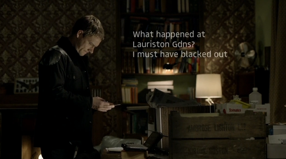
In our lesson today, Ettie and me experimented with adding text to our footage, as the shot of the text isn't quite clear enough to read for everybody.
A choice that we made was how the text appears - we went with the 'typewriter' effect which meant that the characters appeared individually (as they would appear when writing a piece of text). Another decision was the style i.e. font, colour, size. Due to the background being very light, we tried both black and white. We will try a few different varieties and get some audience feedback.
A real example that uses this technique is 'Luther'. They have used a white font because of the dark backdrop, allowing it to stand out more. We have yet to decide whether we want the text to appear in a bubble or text box.
This video explains how post production text works. (http://vimeo.com/103554797)
Changing the text can be done on 'controls' - you can change the speed at which it appears, the spacing of the text, font, colour etc.
You can preview it by going on the 'video' tab, and then drag it on when you're happy with it.